Newfoundland and Labrador Federation of Labour
Client
Sectors
Labour
Human Rights
Services
Brand Design
Campaigns
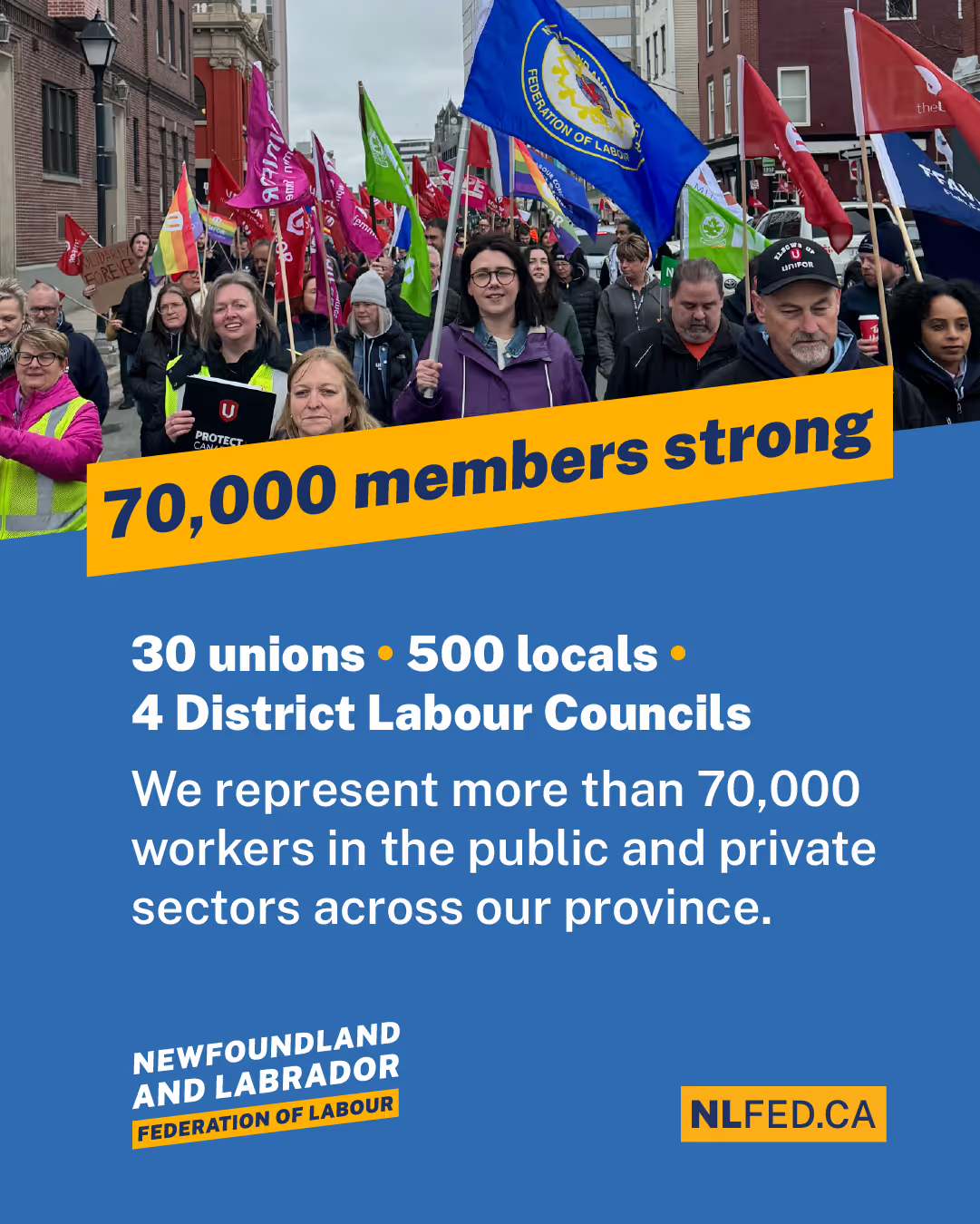
The Newfoundland and Labrador Federation of Labour represents the collective strength of unions and workers in the province. The federation fights for fair wages, safer workplaces, stronger labour laws, robust public services, and to build a province where no one is left behind.
As the federation prepared for two pivotal moments – their 2025 convention and the Newfoundland and Labrador provincial election – they recognized the need to update their visual brand. The federation’s original logo, created in the 1950's, carried historical weight but no longer reflected the dynamism and leadership of the province's modern-day labour movement. The challenge was to create a brand that could honour the federation’s history, resonate with today’s workers, and be flexible enough for the federation's everyday use — including for rallies and picket lines, campaigns, and large-scale events like their convention.
Our work together began with a collaborative kickoff, mapping the federation’s goals, values, and audiences. The federation's new brand is distinctively inspired by both the deep history and current strength of the labour movement — and by the beauty in Newfoundland and Labrador itself.
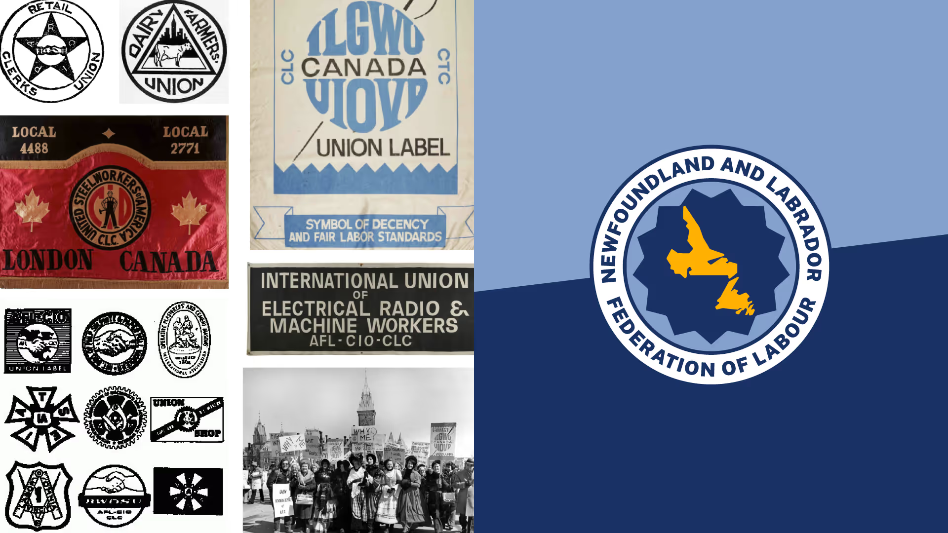
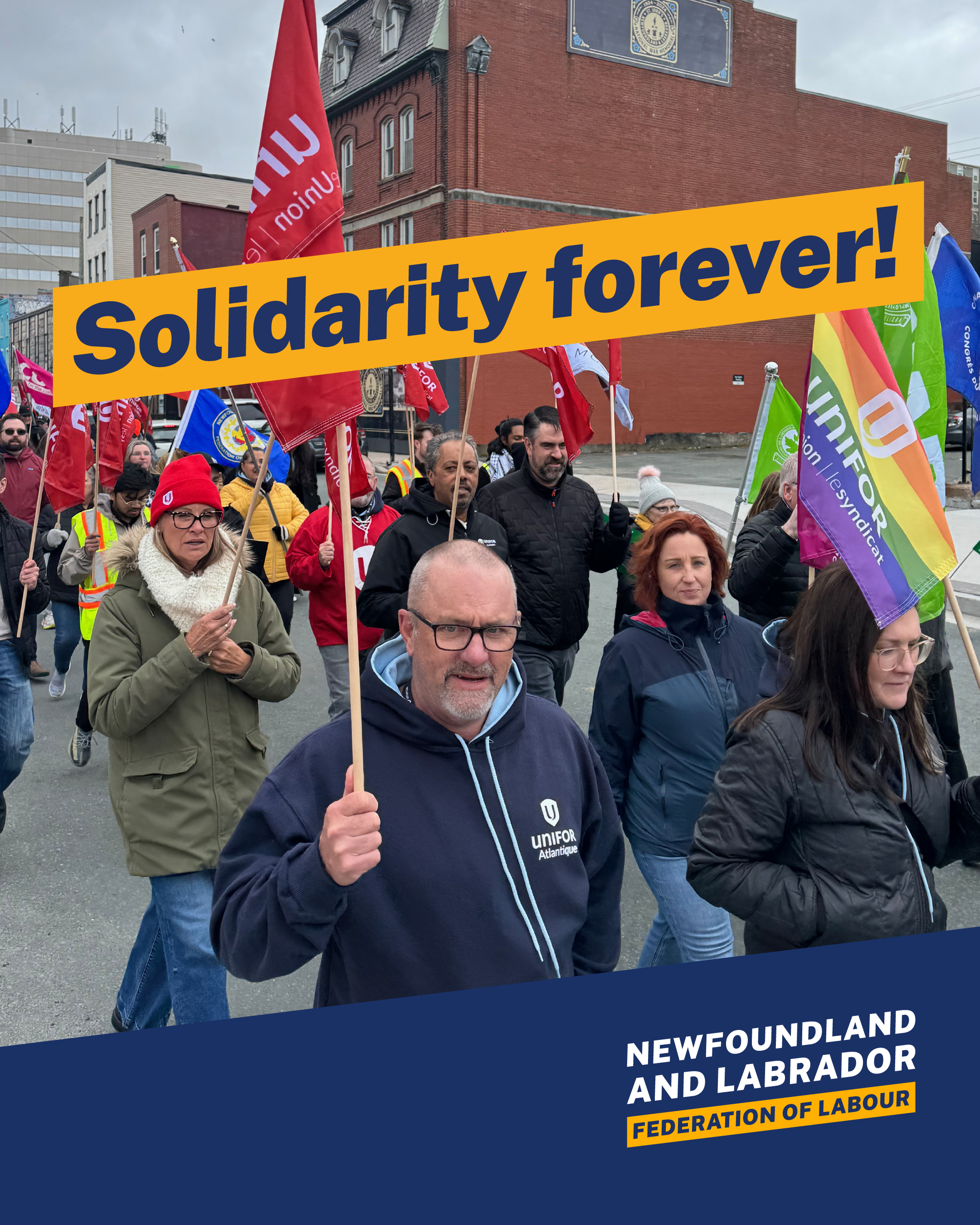
Our design team did a deep dive into the visual history of the labour movement to inspire the new brand.

.avif)
To honour the legacy of the Newfoundland and Labrador Federation of Labour, we modernized the logo the Federation had been using since the 1950's.
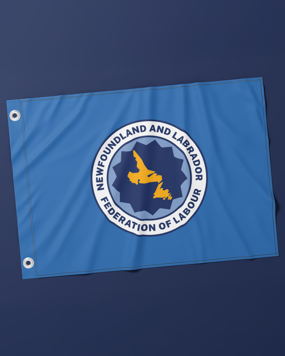
Updating a Labour Logo from the 1950's
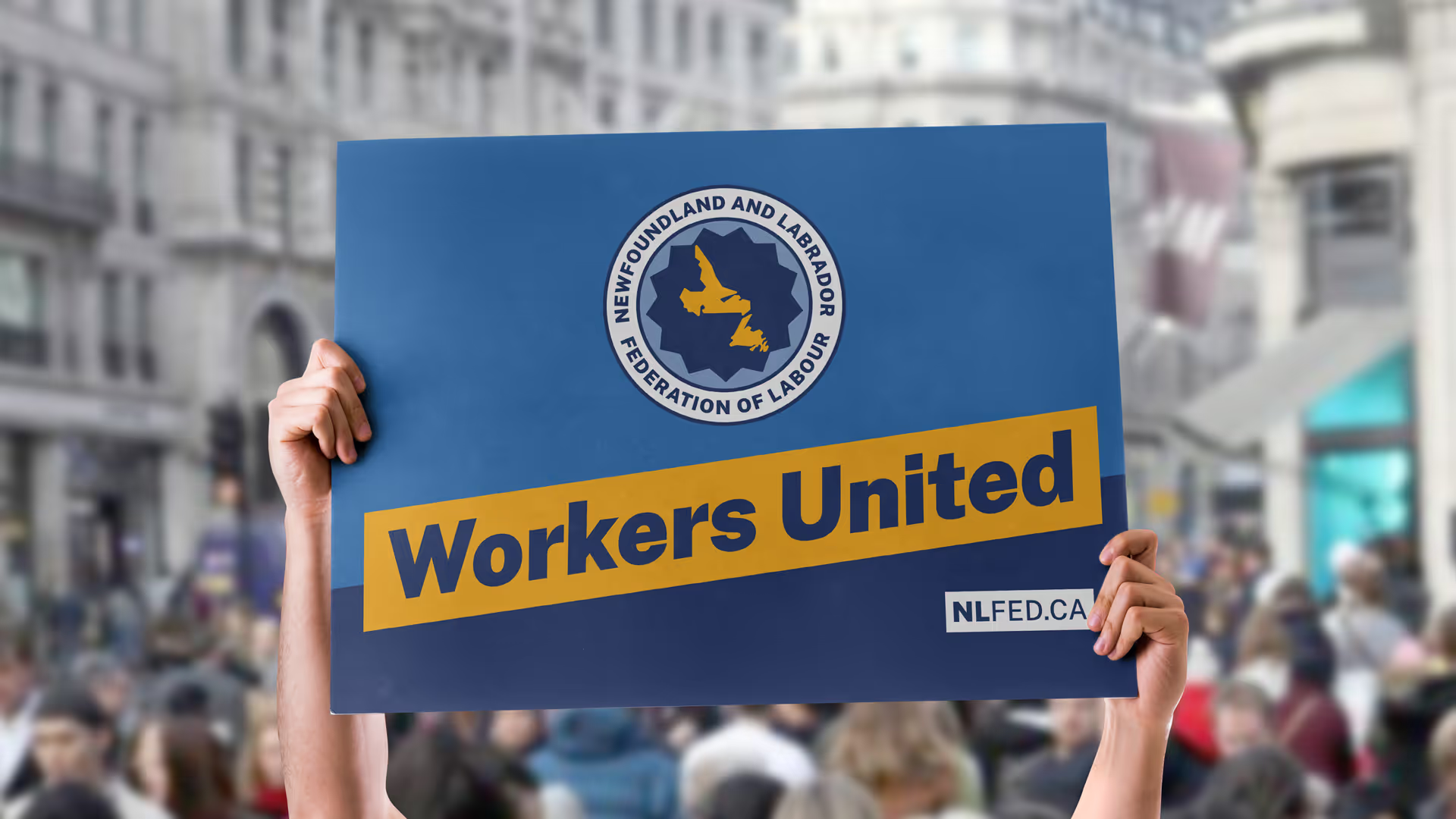
The updated crest-style-logo reflects the balance between old and new, nodding to the federation’s previous logo while streamlining its form for clarity and impact. At the centre is a 13-point star, echoing the shape of a gear – a reminder of the cooperation, power, and forward motion that defines the labour movement. The 13-point star was inspired by the original 12-point emblem in the federation’s 1950's logo, which represented Canada’s 12 provinces and territories at the time, prior to the recognition of Nunavut.

.avif)
A Place-Based Identity
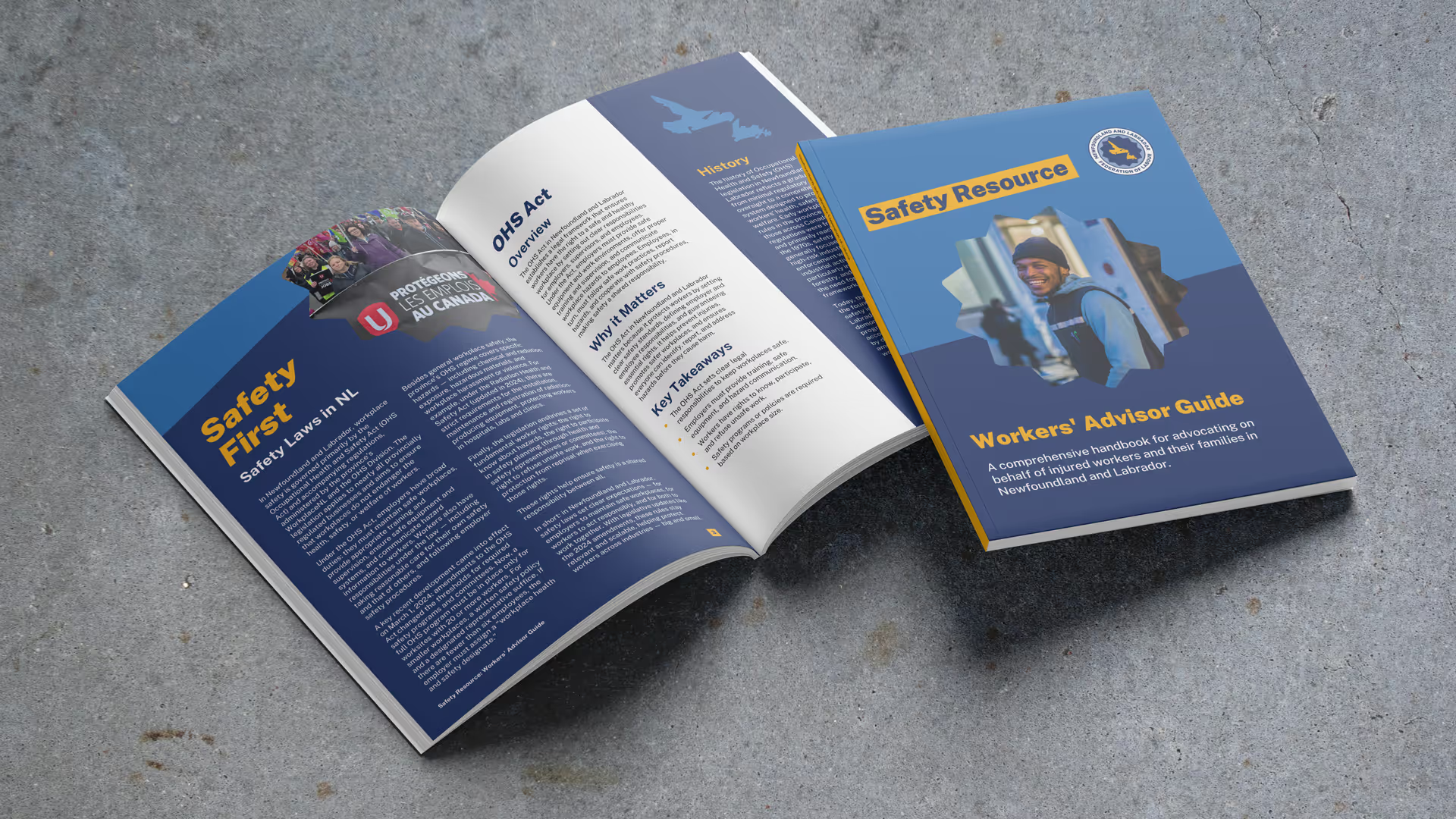
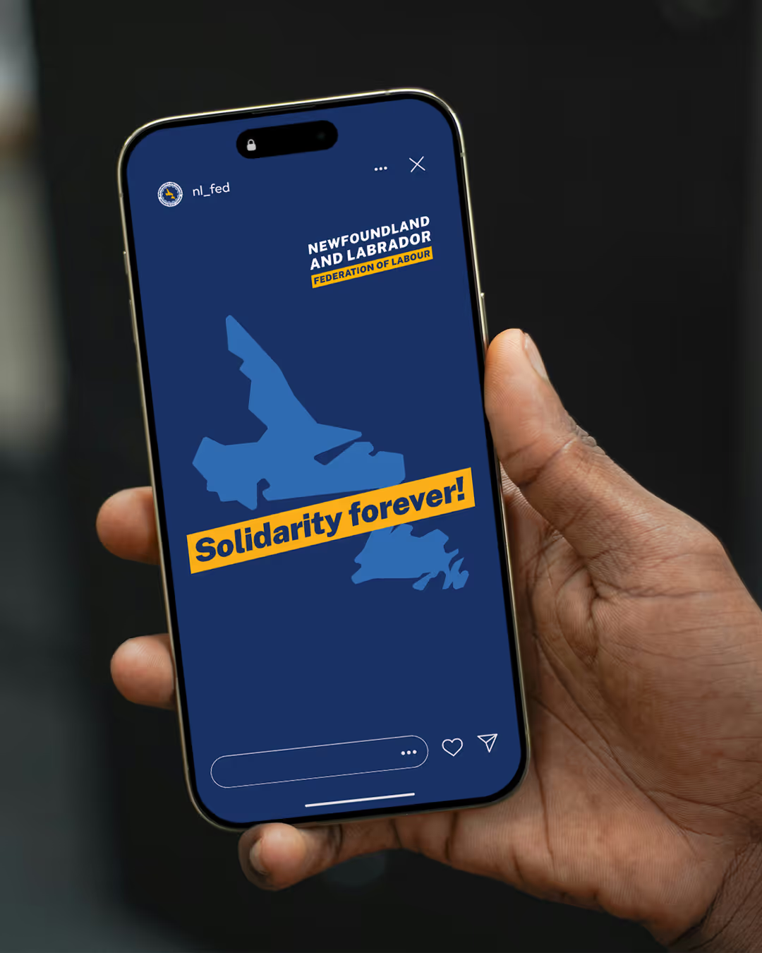
The federation's new brand feels distinctively Newfoundland and Labrador, as the brand is deeply inspired by “place”. The new brand echos Newfoundland and Labrador's landscape and coastline, but without falling into any overused stereotypes. The colour palette nods to both Newfoundland (with "Sky Blue" and "Ocean Blue") and to the labour movement ("Solidarity Yellow" and "Union Navy").
Convention Branding
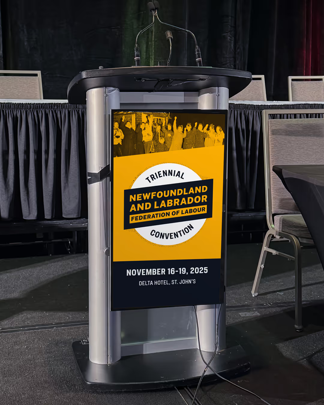
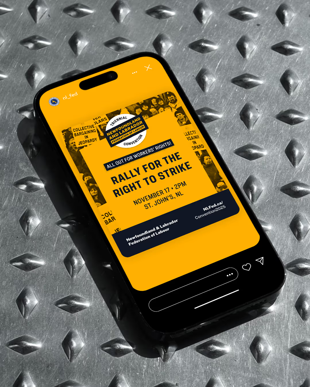
The Newfoundland and Labrador Federation of Labour’s 2025 Triennial Constitutional Convention took place from November 16–19 in St. John’s. The convention brings together union leaders, members, and allies from across the province as a powerful moment for the labour movement in Newfoundland and Labrador.
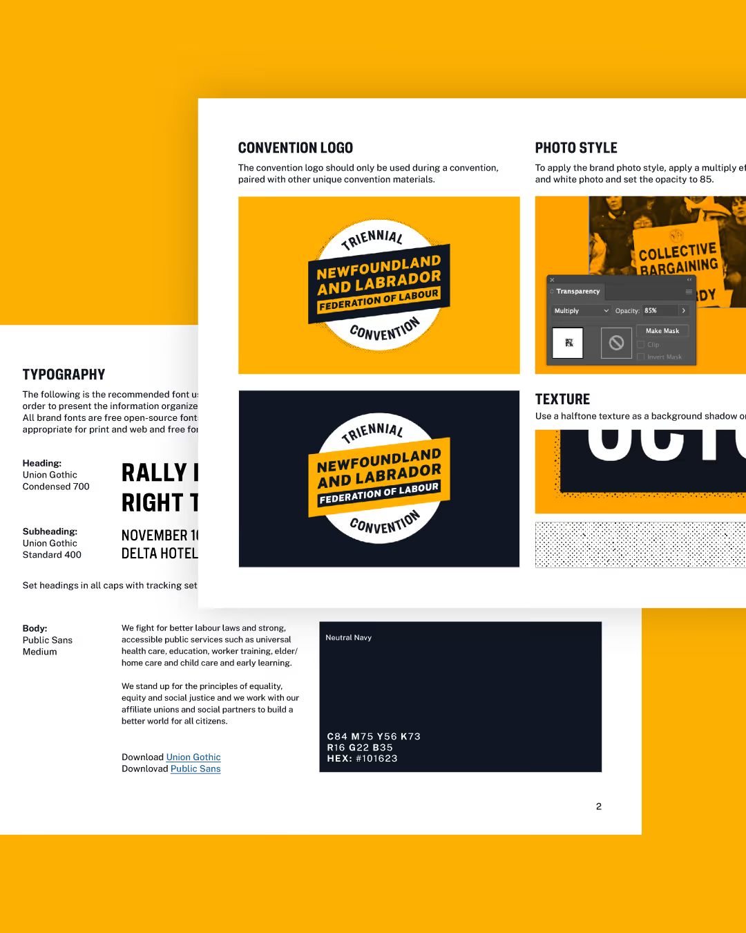
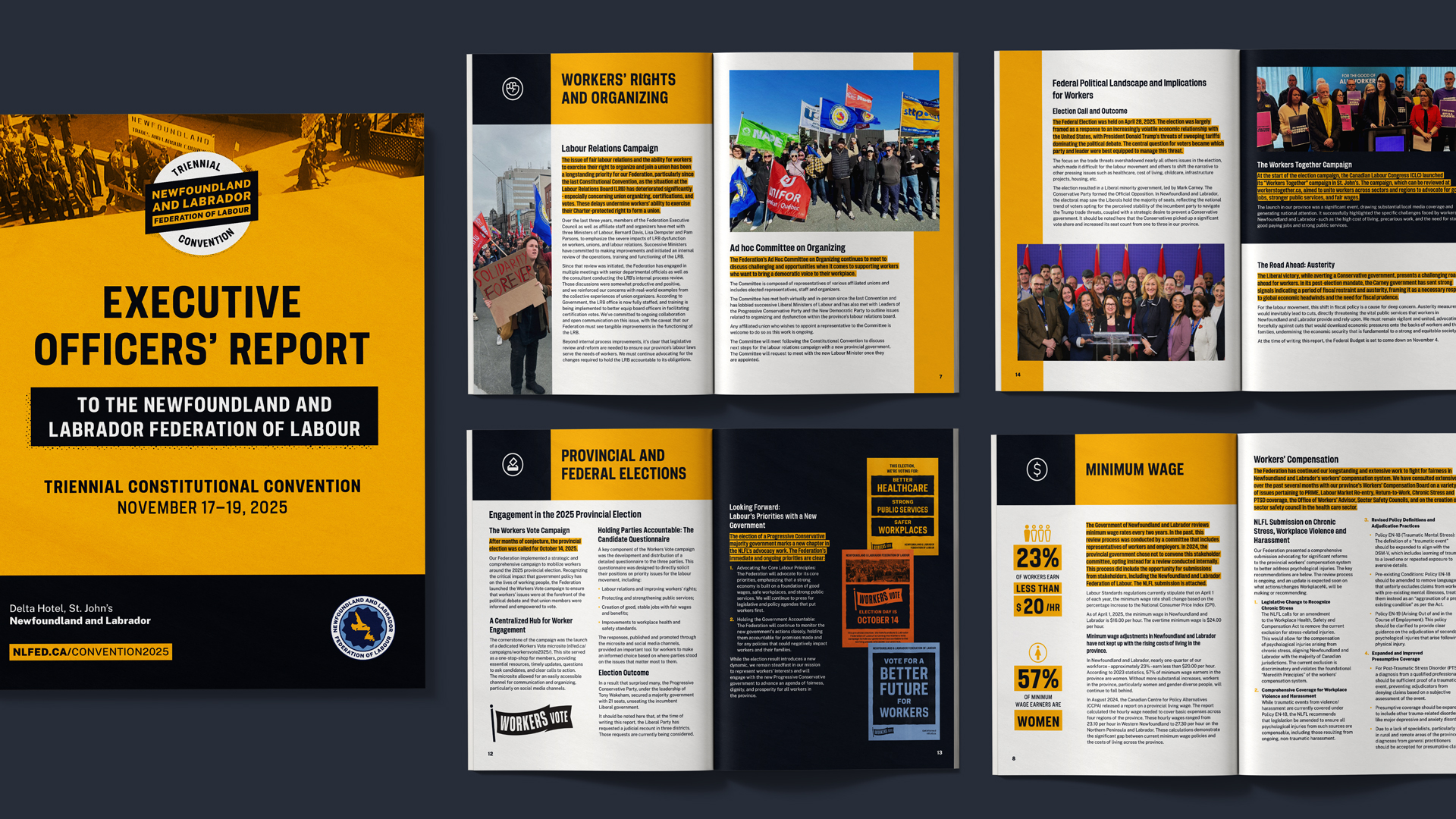
Guided by the idea of getting back to the fundamentals of the labour movement, we worked with the federation to develop a cohesive and accessible visual system for the convention. Our team established the look and feel through a concise style guide, ensuring that every piece of communication – from the Executive Council Report to the merch – reflected a unified tone and visual language.
The bold new convention identity builds on the federation's refreshed brand, while bringing a distinctive twist for the triennial convention.



Workers Vote Campaign
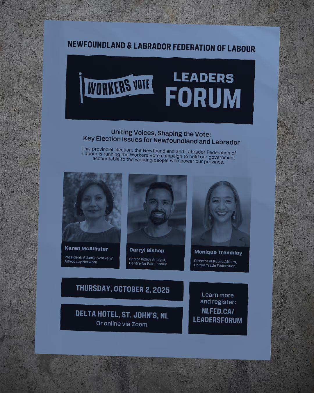
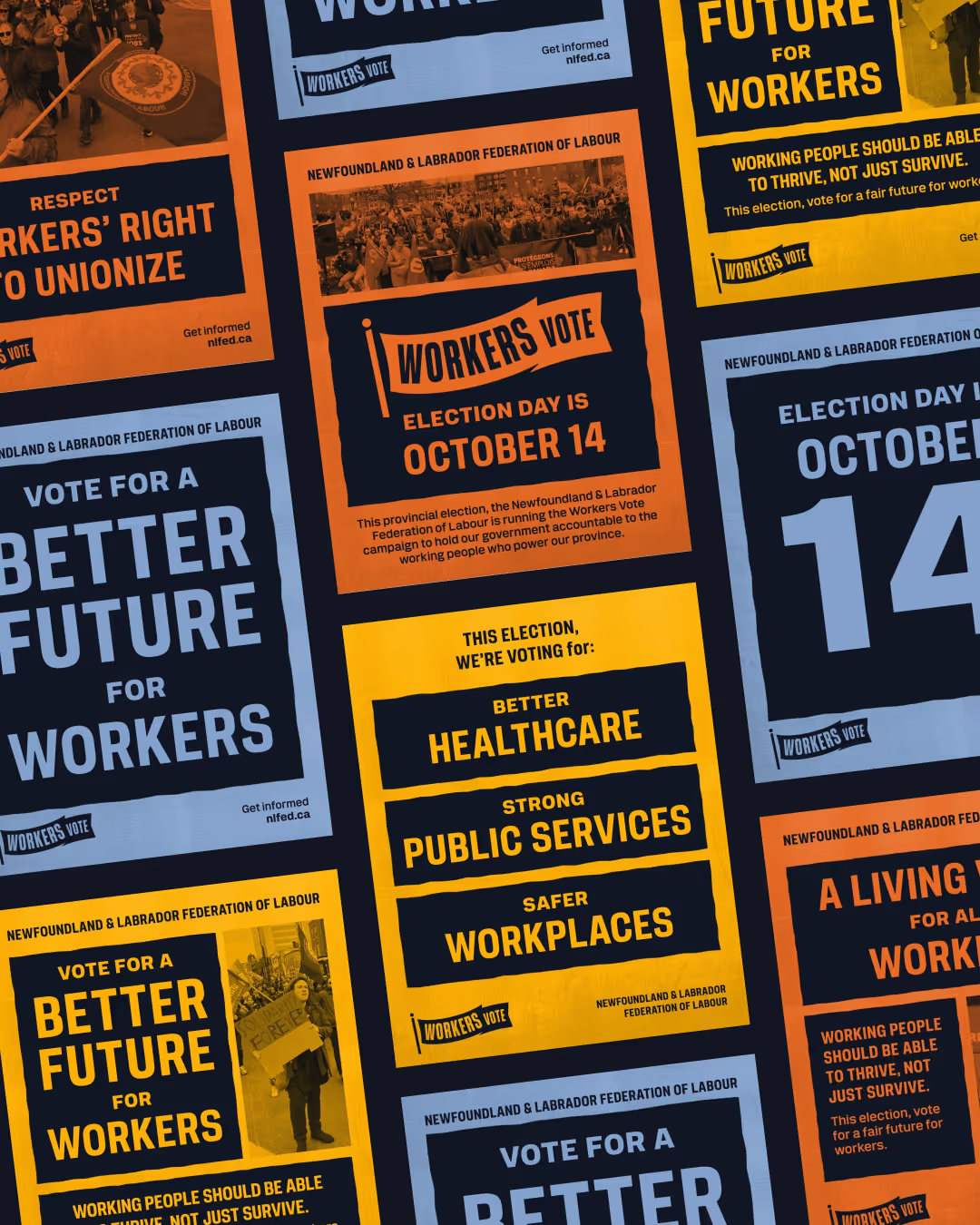
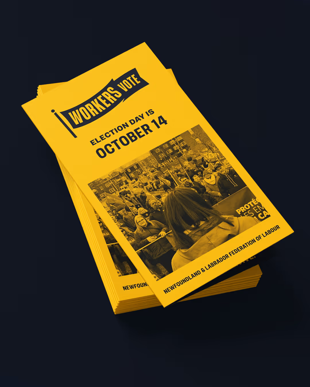
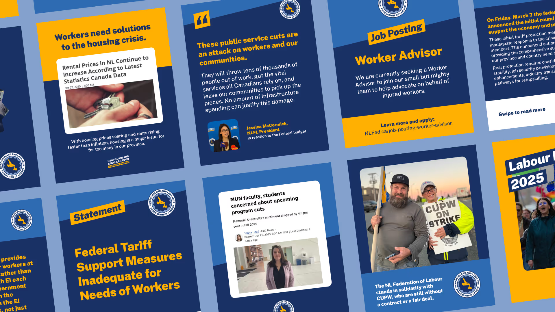
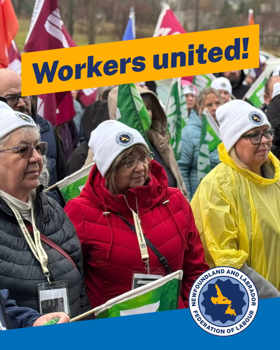
When we started working with the Newfoundland and Labrador Federation of Labour, our very first task wasn't their rebrand. Firstly, we needed to help the federation prepare a campaign for Newfoundland and Labrador's provincial election. The campaign carried a clear and urgent message: that voters should hold the government accountable to the working people who power Newfoundland and Labrador. At its heart, the campaign articulated a bold vision – safer workplaces, better healthcare, stronger labour laws, sustainable jobs and climate action, accessible childcare, respect for the right to unionize, and paid sick leave for all.
The campaign's visuals were designed to amplify this message, pairing urgency with clarity to ensure that workers’ priorities cut through in a crowded election cycle.
.avif)
