Nourish Nova Scotia
Client
Sectors
Anti-Poverty
Food
Social Justice
Youth
Services
Strategy
Brand Design
Website
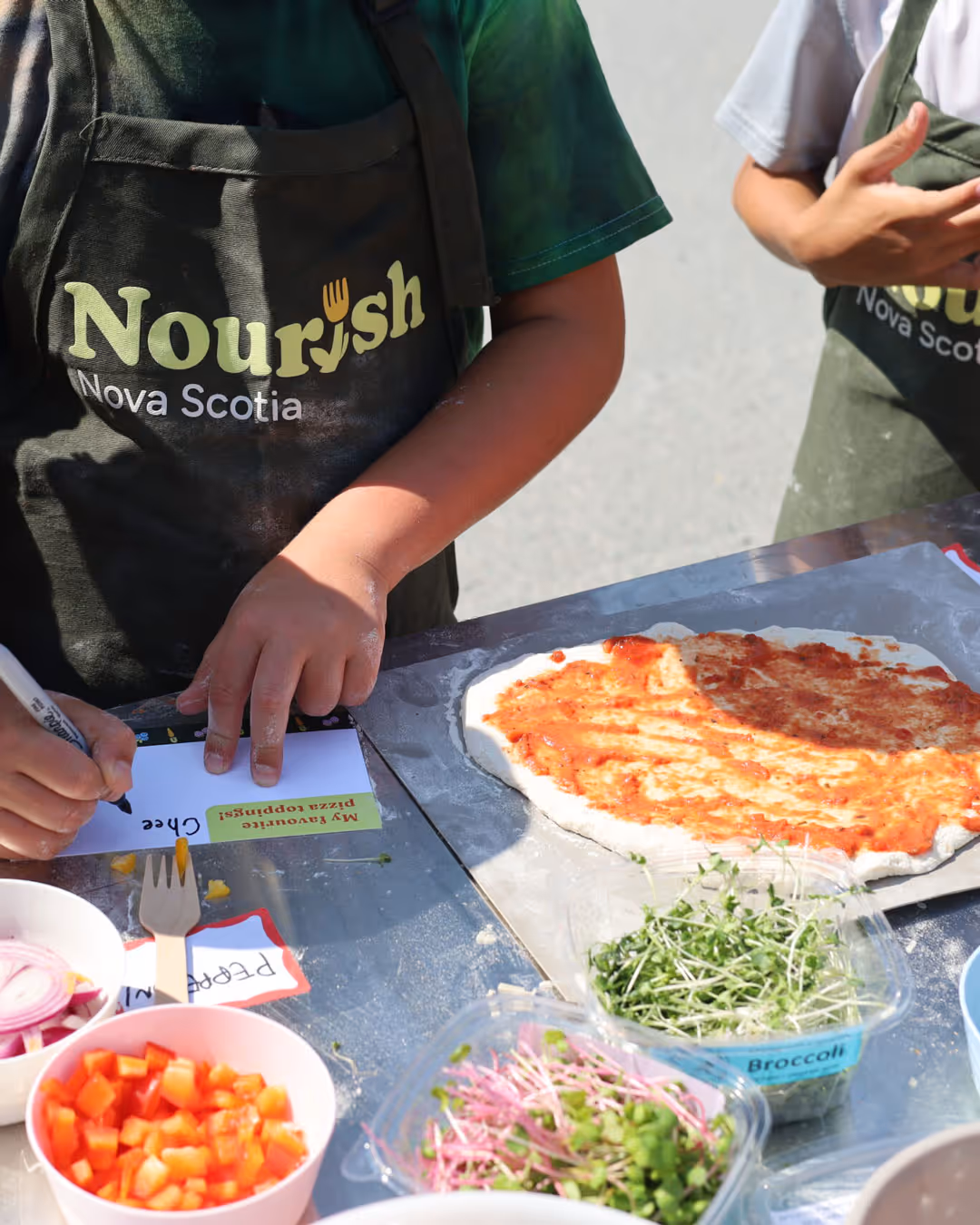
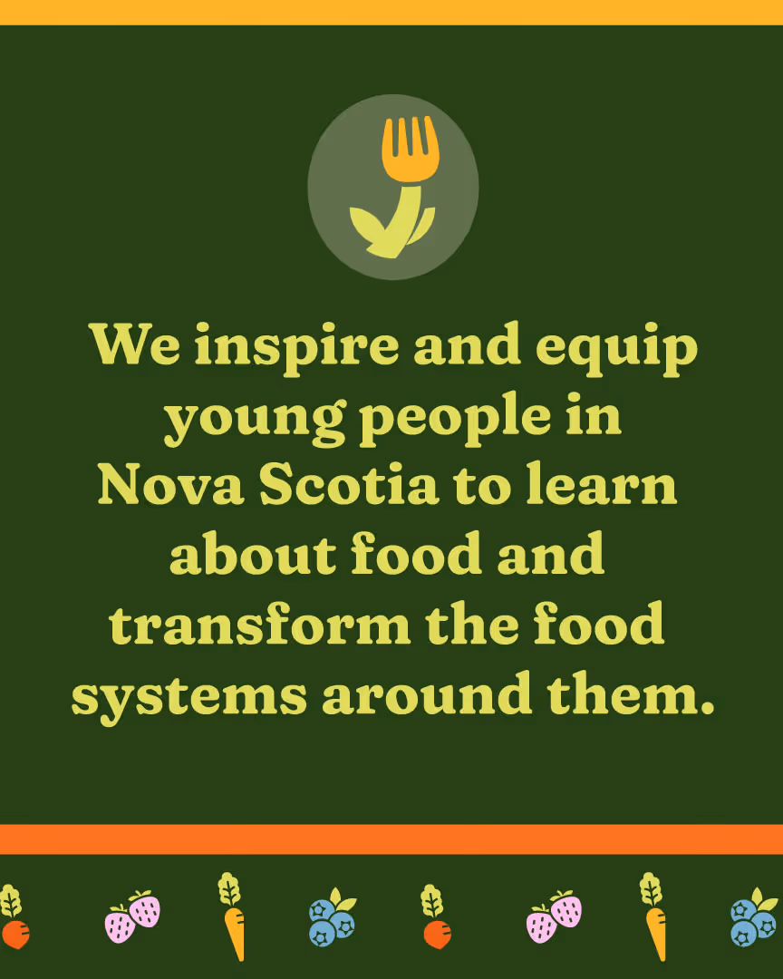
Nourish Nova Scotia is a nonprofit that equips and inspires youth to get involved with — and transform — the food and food systems around them.
In Nova Scotia, young people are key to transforming food systems, yet many youth do not have opportunities to learn about where their food comes from or to see the impact that food has on their communities’ health and wellbeing. Through hands-on learning related to food, Nourish Nova Scotia inspires and equips the next generation to drive meaningful change in their communities and become leaders in shaping a healthier, more sustainable future.
As Nourish Nova Scotia continued to grow, they approached us to help revamp their communications strategy, revisit their messaging, and rebrand their organization. As a core goal, Nourish Nova Scotia wanted to shift their "positioning" and become known as an organization focussed on systems change and advocacy.
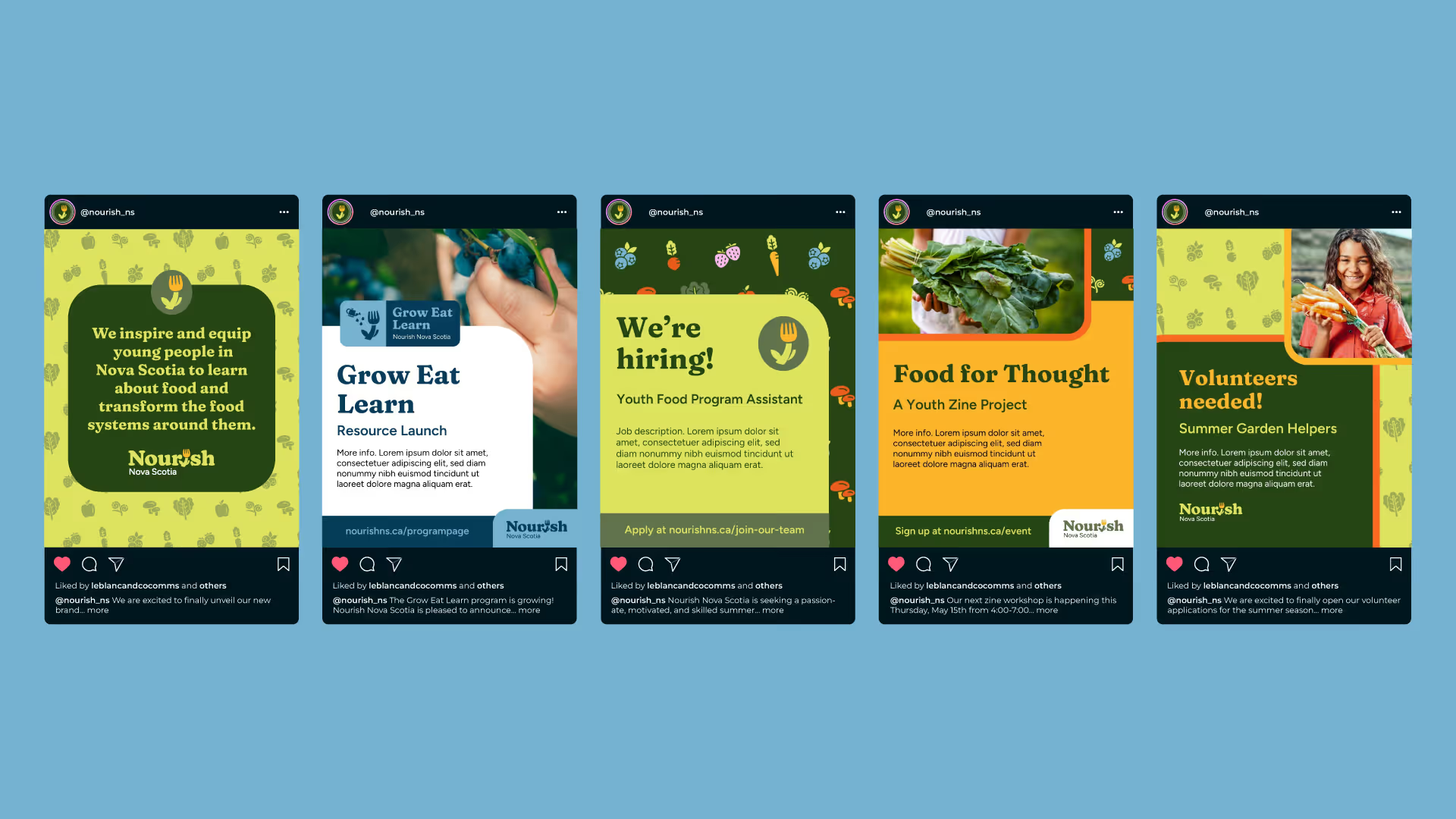
Nourish Nova Scotia wanted their communications presence to capture the energy, creativity, and hope that young people bring to their mandate of transforming food systems. To meet their needs, LeBlanc (& co.) helped them develop a Communications Strategy, Message Guide, and a complete visual rebrand, including a new website.
Firstly, we worked with the Nourish Nova Scotia team on a strategy and research phase. We developed a comprehensive Communications Strategy and refreshed Message Guide. In the strategy phase, we clarified the organization’s communications objectives, pinpointed target audiences, and helped shape the core messages and brand positioning that would speak to young people, educators, and community partners. Our goal was to strengthen Nourish Nova Scotia’s communications strategy and messaging — so that they could clearly communicate the impact they make in Nova Scotia, particularly related to systems change.
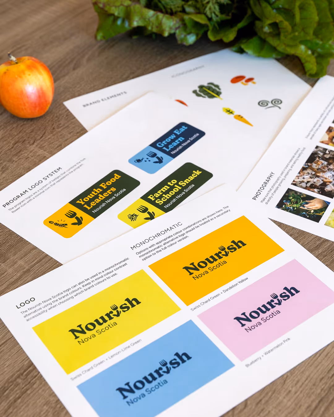
The strategy and research phase also identified the path forward for the visual rebrand. Nourish Nova Scotia needed a new brand identity that would speak directly to both young people and educators, capturing the dynamic, hands-on approach that defines Nourish Nova Scotia’s work. To address this, we led them through a rebrand to create a new identity that would excite and inspire youth, while still being professional enough to engage educators, community partners, and donors.
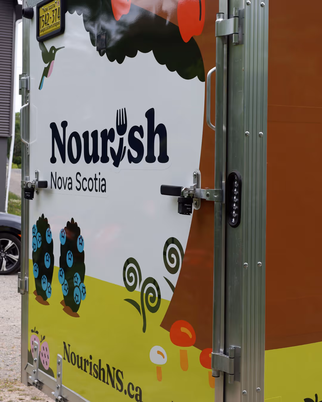
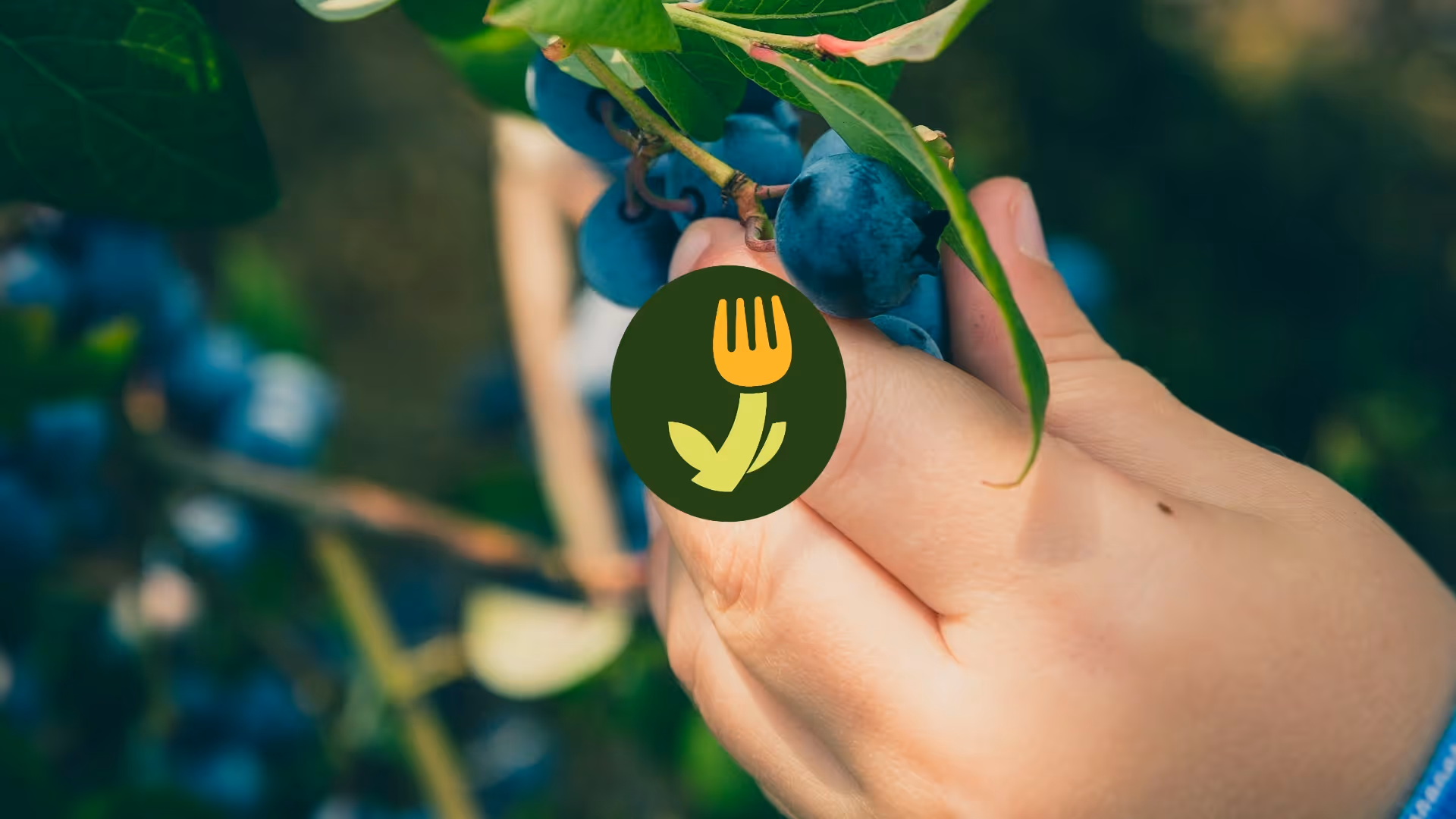
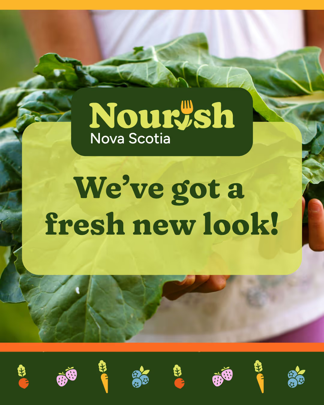
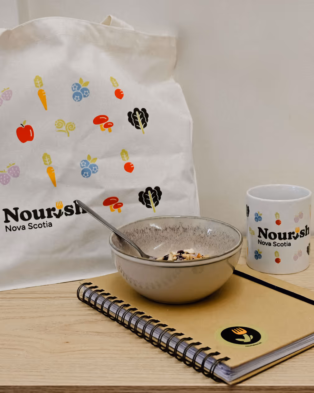
As an objective in the rebrand, Nourish Nova Scotia wanted to honour their organization’s history. We accomplished this by refining their old logo concept – a “fork flower” icon that represented both food and nature – to modernize the visual brand while nodding to their past.
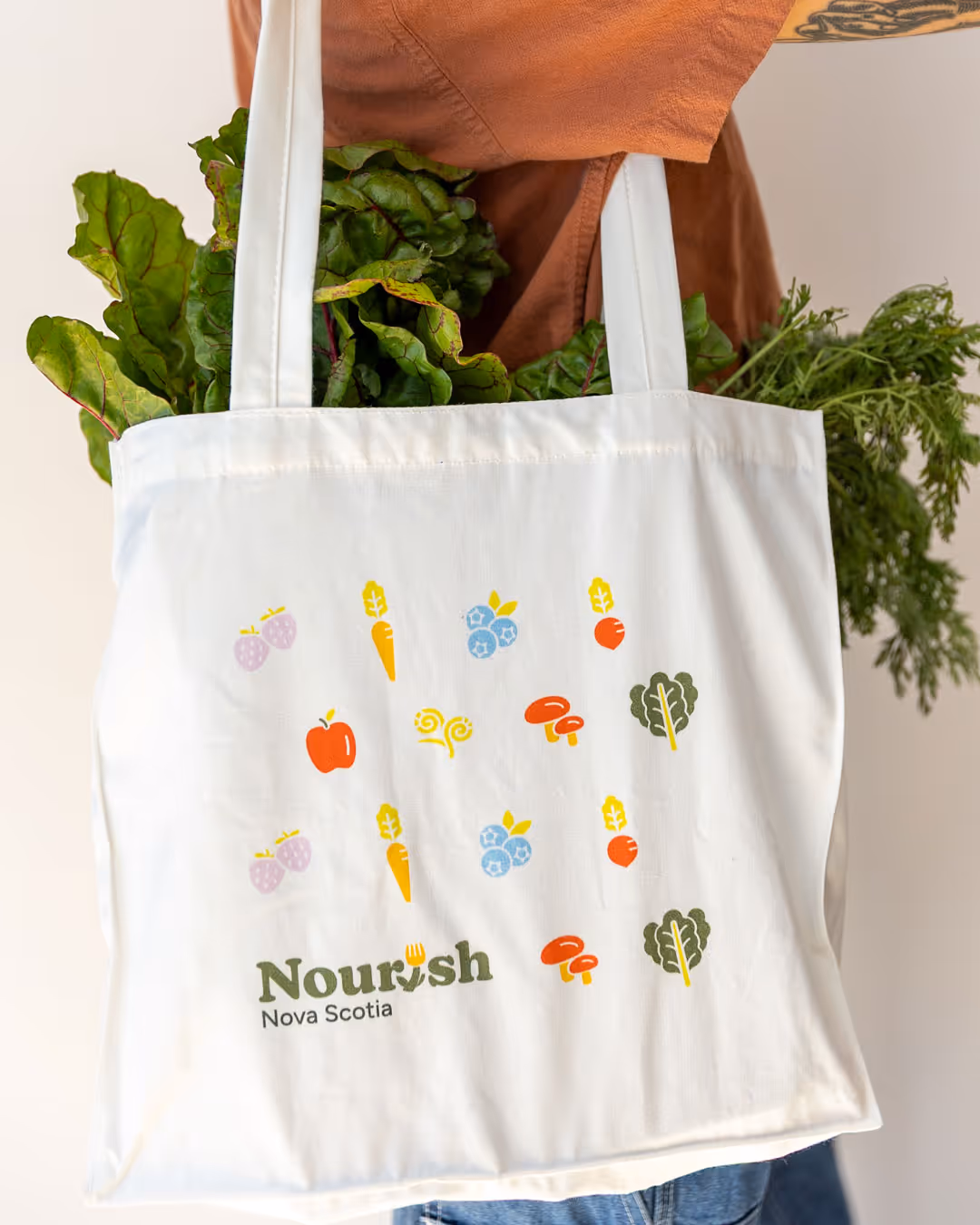
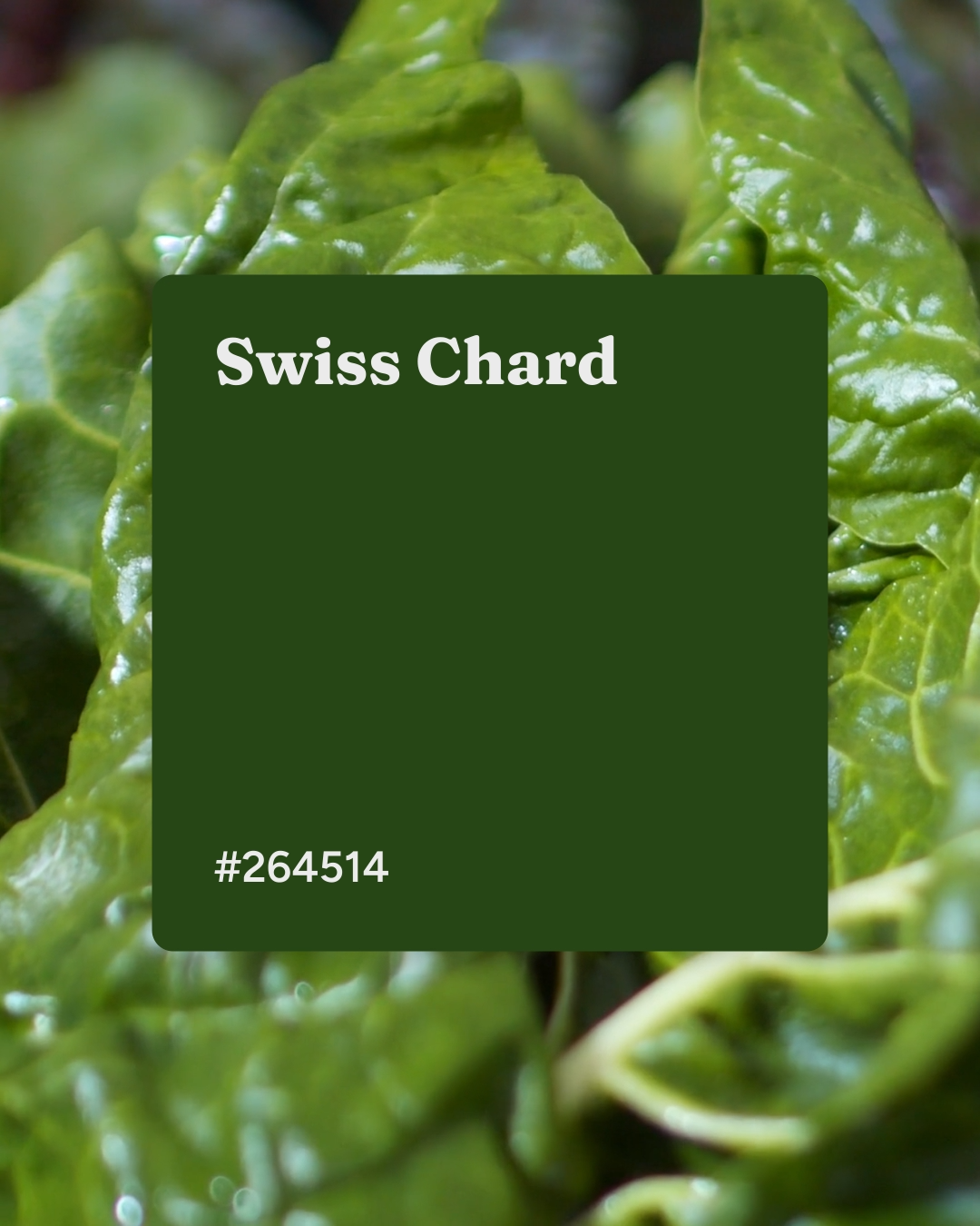
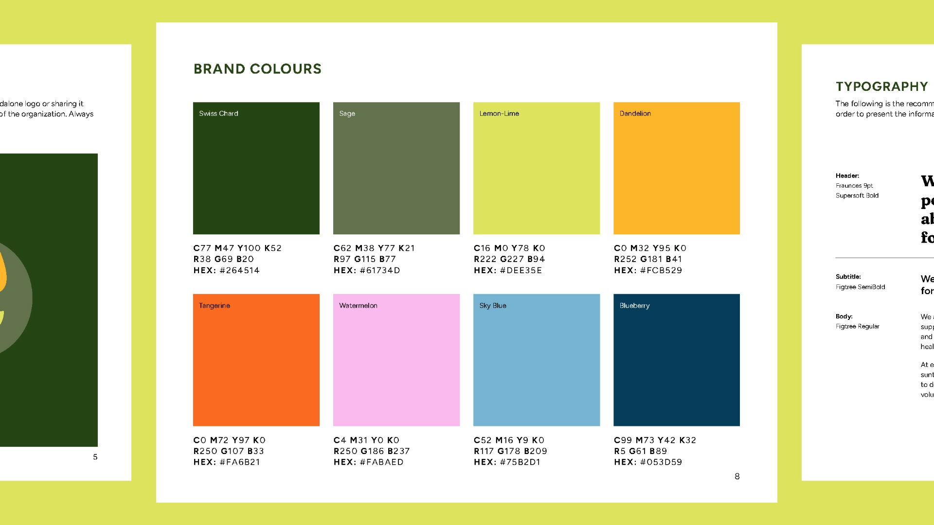
We developed a colour palette that was vibrant and lively — colours that evoke freshness, vitality, and connection to nature. These colours are not only visually appealing but also reinforce Nourish Nova Scotia’s commitment to sustainability and local food systems.
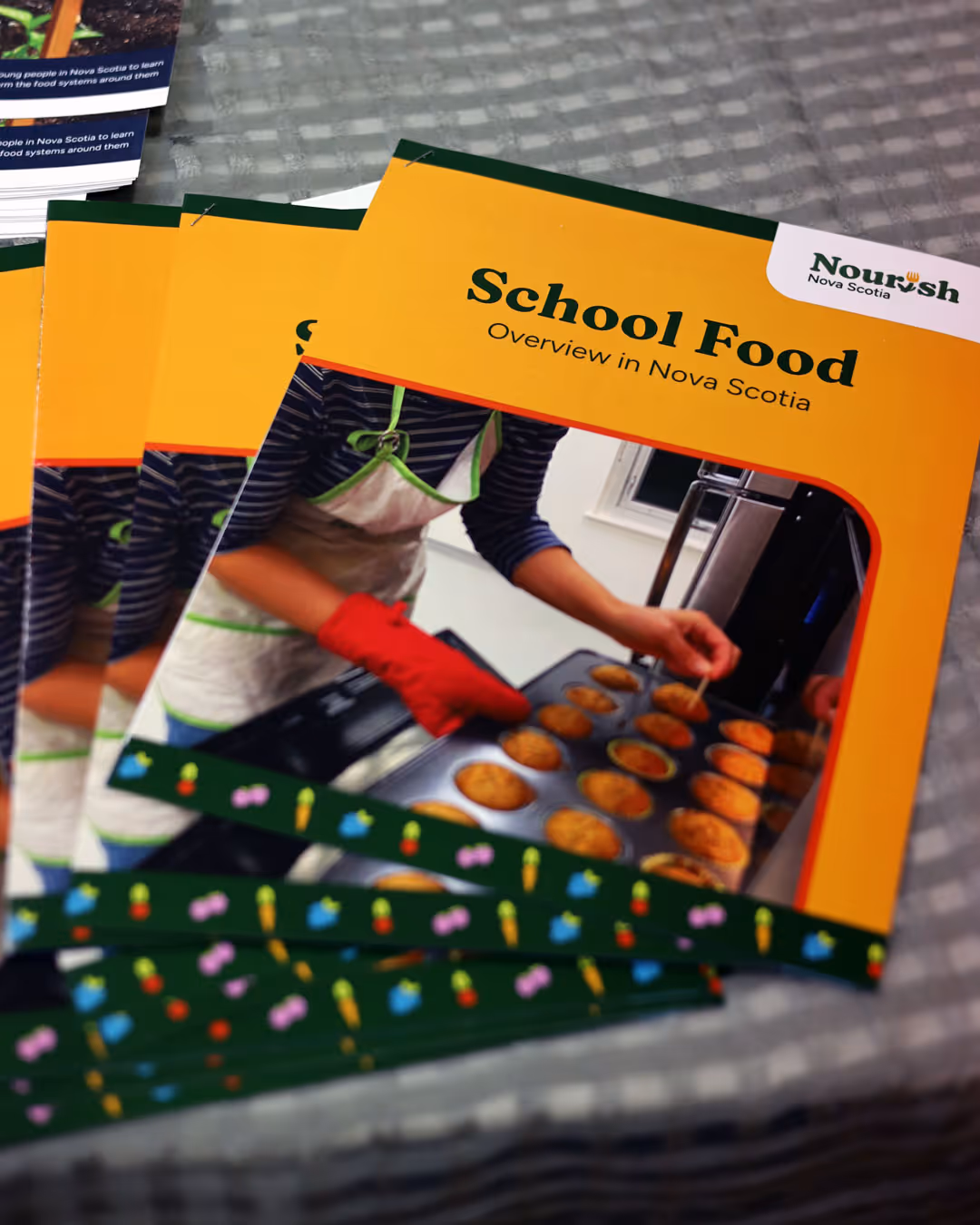
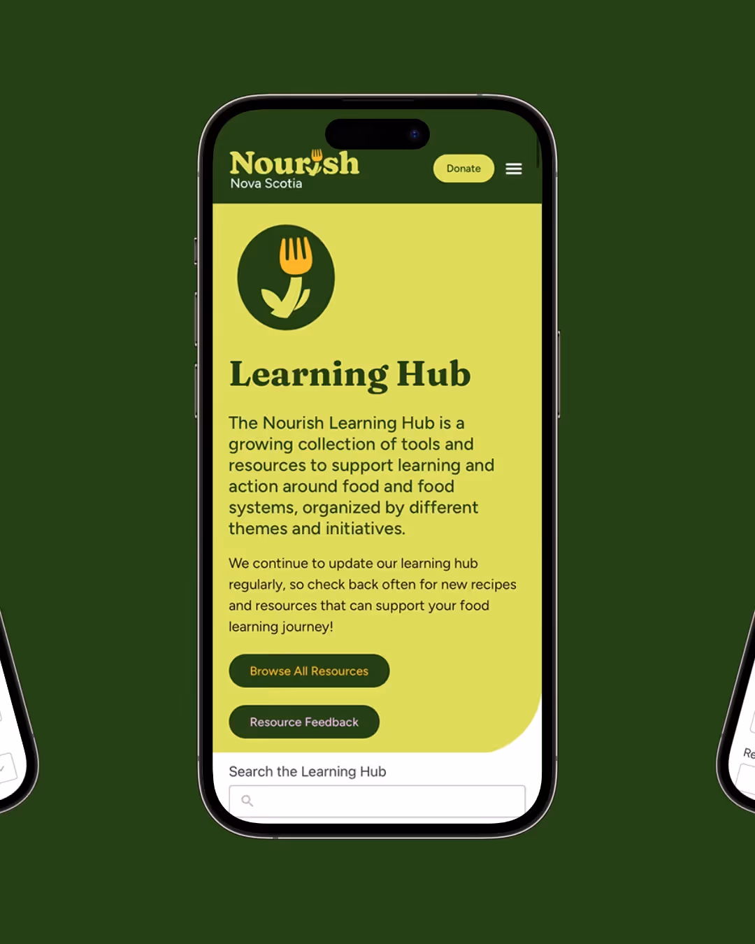
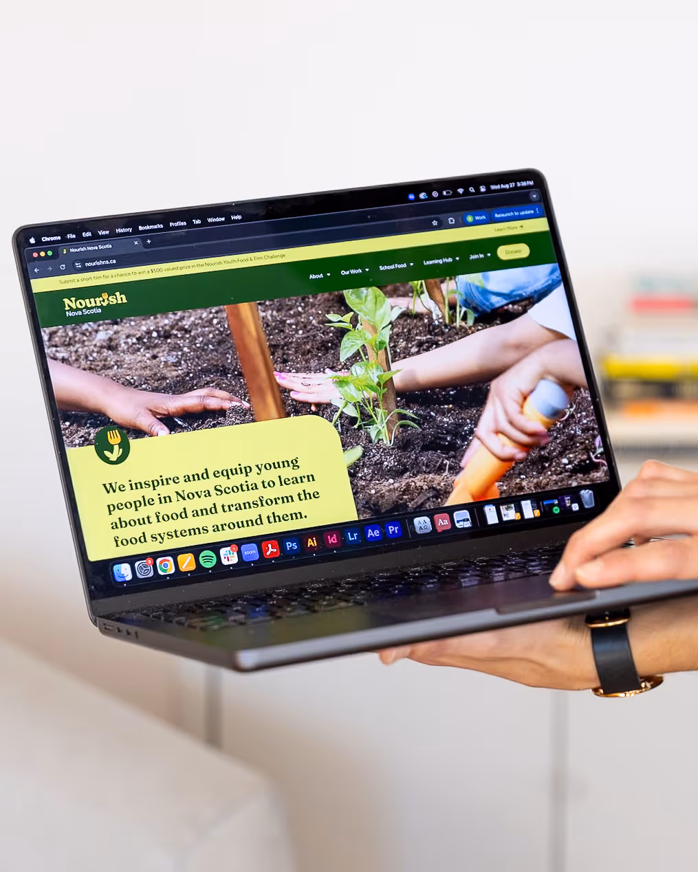
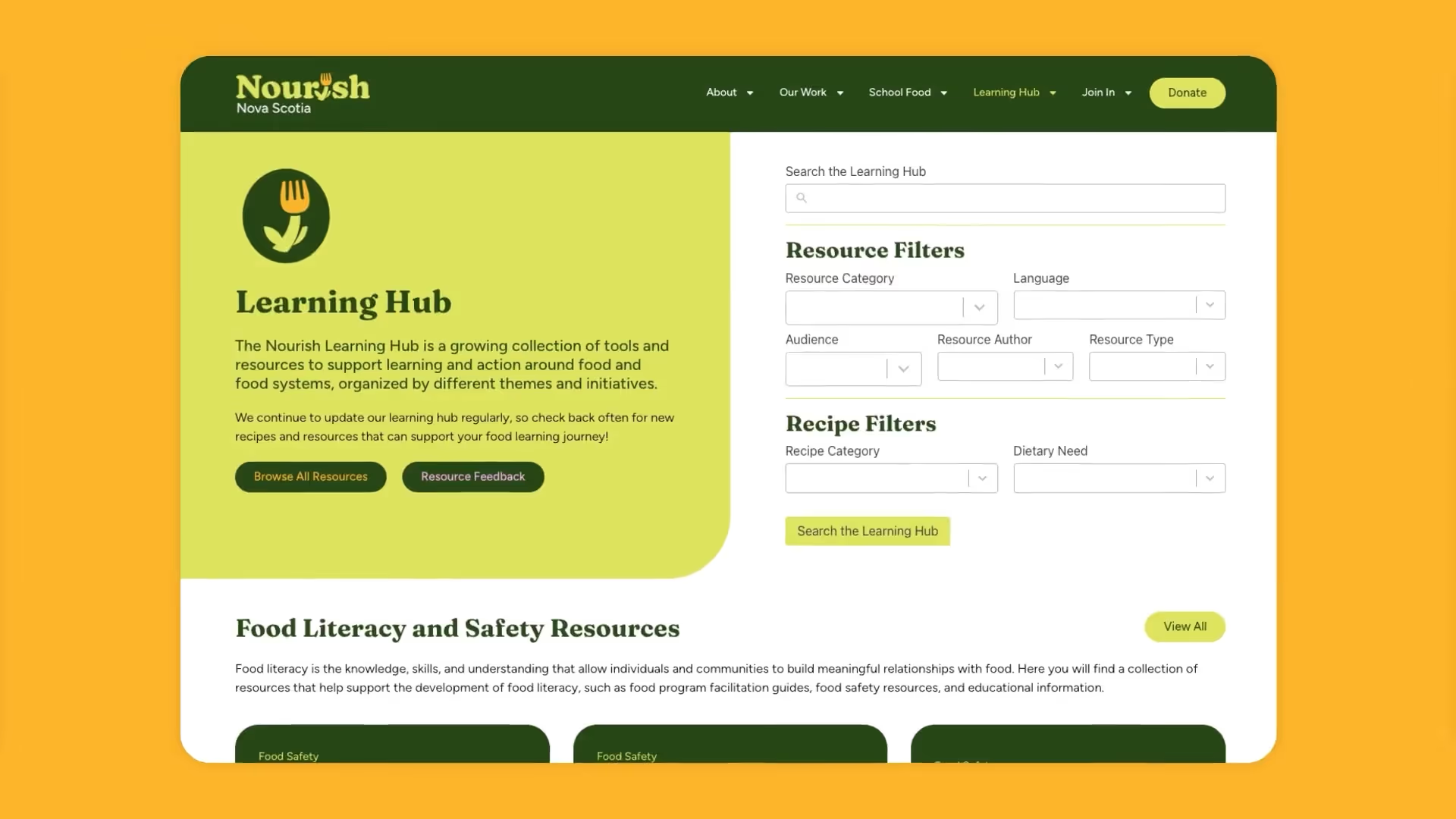
Our team also designed and developed a new website to match the updated brand. Working closely with the Nourish Nova Scotia team, we built out the new website with a learning hub to house their library of resources including kid-friendly recipes, gardening activities, and educational tools for teachers. The website was designed and developed with a focus on user experience, both for Nourish Nova Scotia’s external audiences as well as their internal team managing the site.


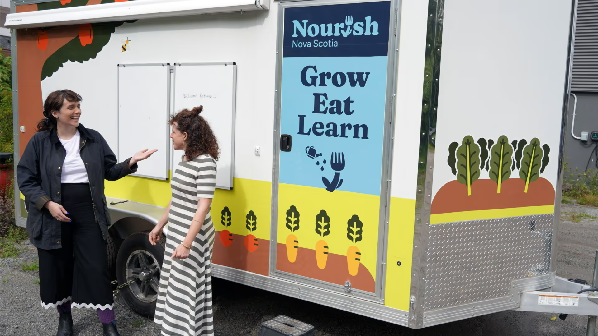
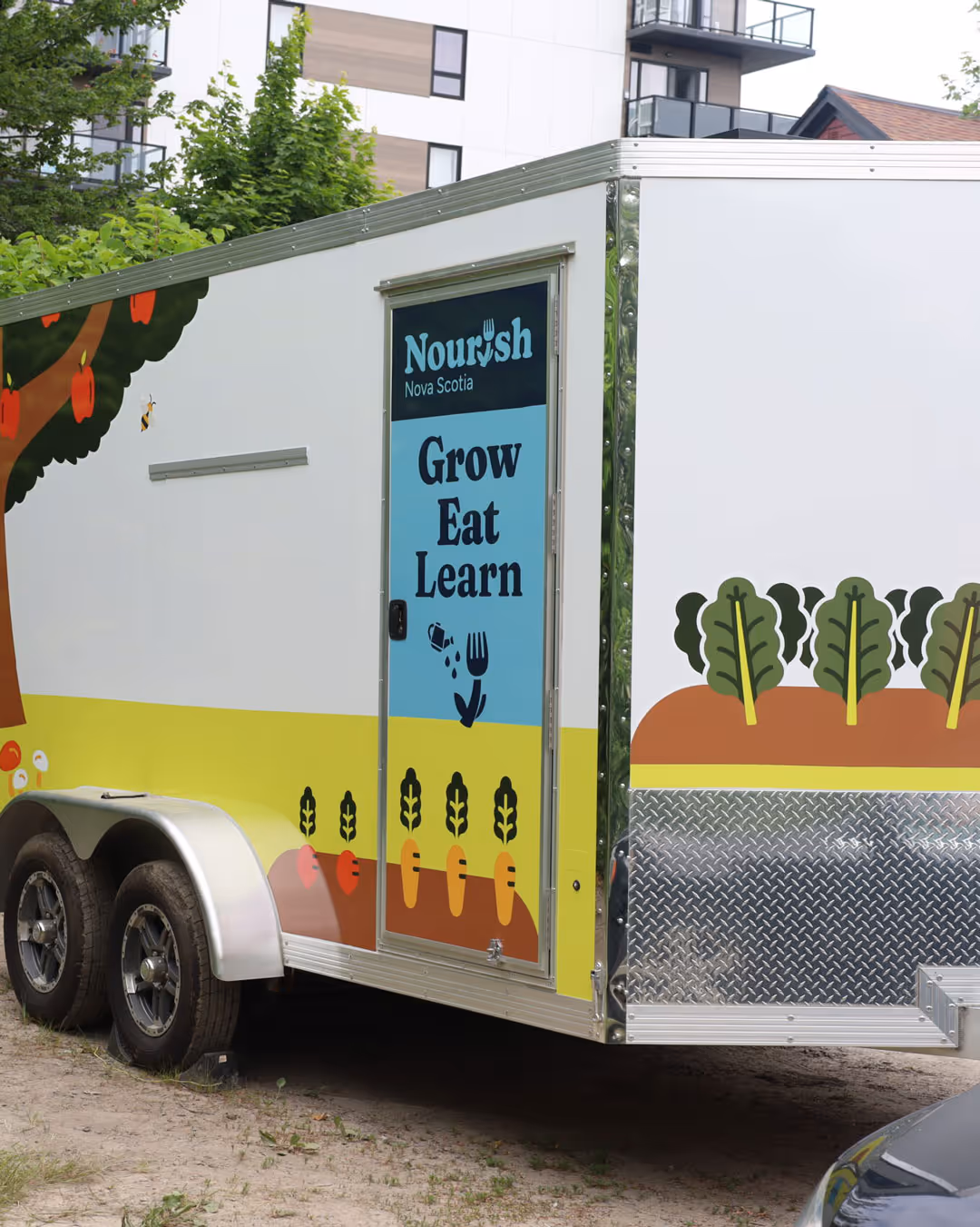
The Grow Eat Learn Trailer
In collaboration with OSO Planning + Design, our team designed the wrap that decorates the Grow Eat Learn trailer, which visits different locations in Nova Scotia in order to teach kids about food through offering hands-on learning experieces.
The Grow Eat Learn trailer hosts activities like cooking and gardening workshops to help kids throughout the province learn about healthy food, local food, food security, and other areas of food systems.
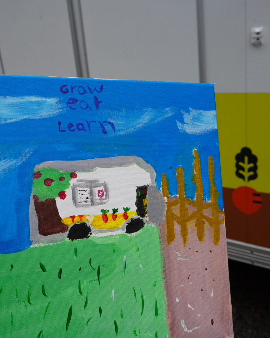
This painting of the Grow Eat Learn trailer was created by a youth program participant (and budding young artist).