Surrey Women's Centre

Client
Sectors
Gender Justice
Human Rights
Services
Brand Design
The Surrey Women’s Centre is a trusted provider of care and advocacy for survivors of gender-based violence. Grounded in feminist and anti-oppressive values, their team provides wraparound services and supports for survivors of trauma through community partnerships across Surrey, surrounding areas, and beyond.
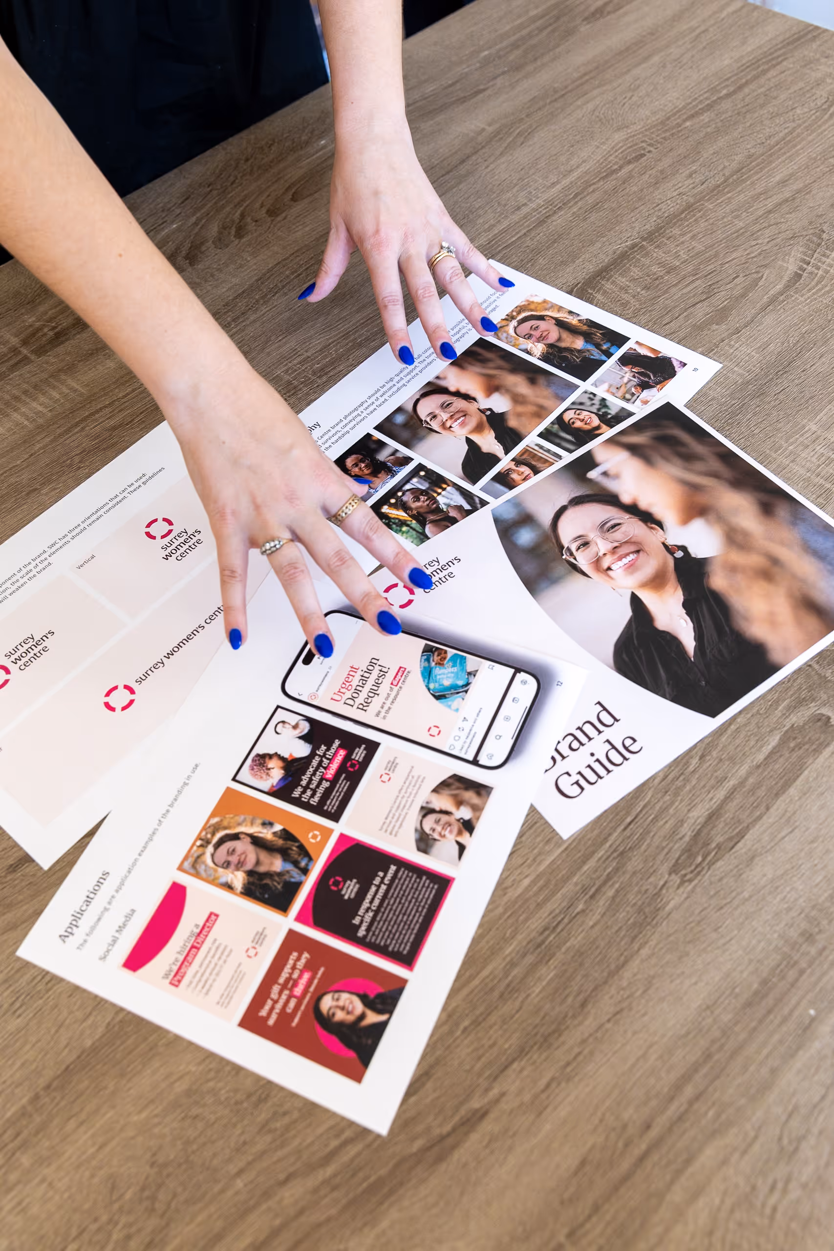
The Surrey Women’s Centre partnered with LeBlanc (& co.) Communications to refresh their visual brand, honouring their previous brand identity while modernizing its tone and visual presence. We worked closely with their team to refresh their brand, aiming to maintain continuity, while evolving their visual system to reflect who they are today.
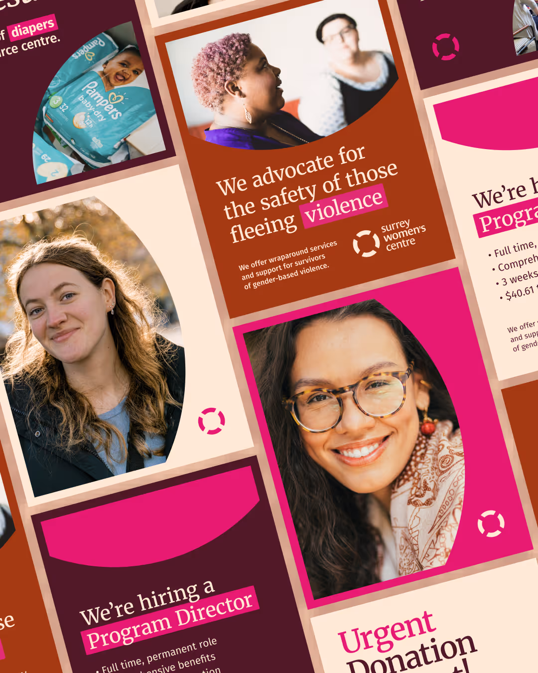
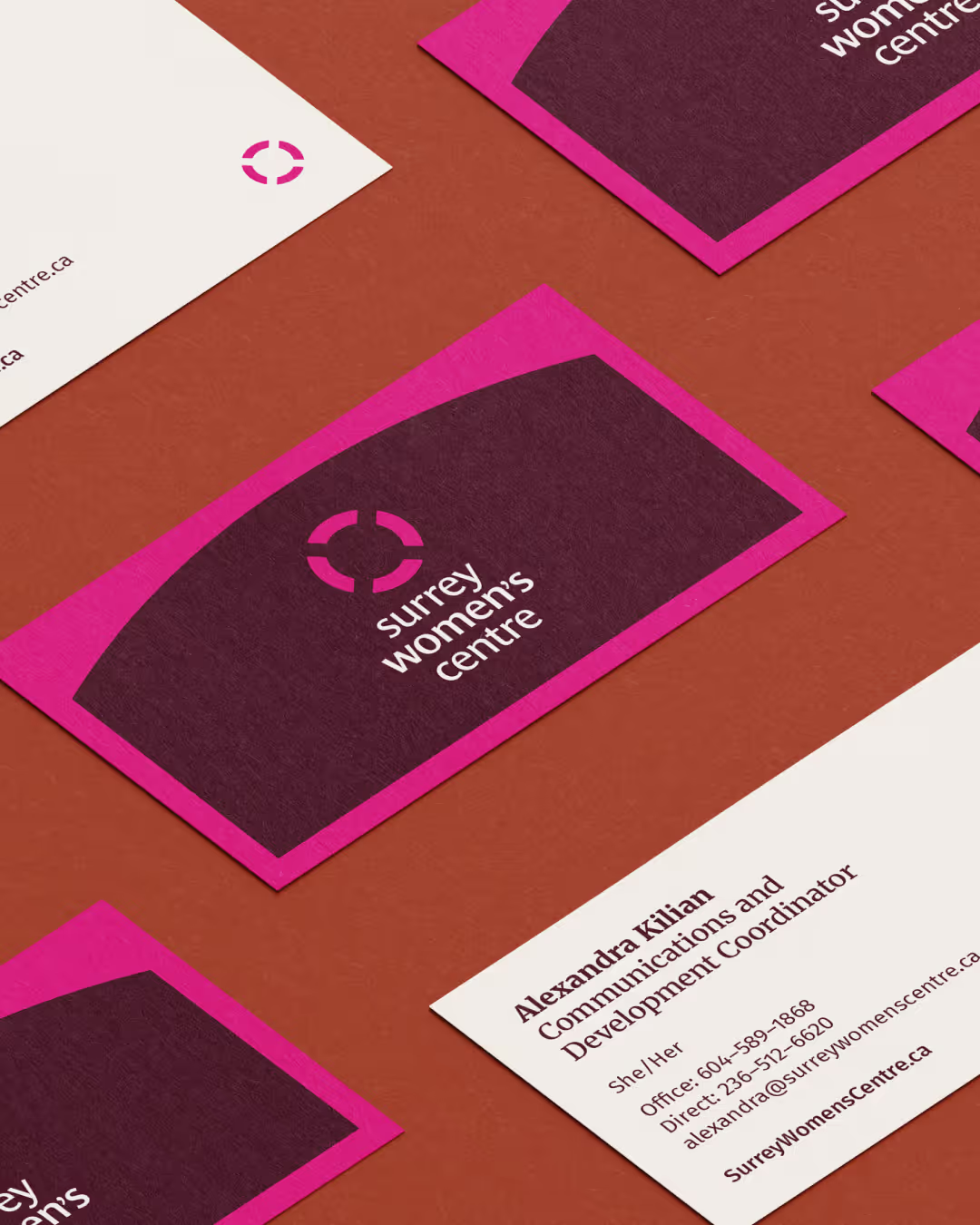
Previously, the Surrey Women’s Centre's visual identity relied heavily on a single shade of bright pink. The updated palette was designed to feel more welcoming to diverse gender identities while maintaining recognizability within the community. The new, refreshed colour palette expands that foundation, introducing a set of warm neutrals paired with rich pink accents to create a more versatile and accessible brand identity. The built-out colour palette is easy to use across digital and print formats, bringing a sense of warmth, professionalism, and care while remaining true to the Surrey Women's Centre’s recognizable pink. Maintaining a nod to the original pink was a priority, as their local brand recognition fuels their fundraising.
The Surrey Women’s Centre's previous logo was refined to enhance clarity and warmth without losing recognizability. The original logo featured a life preserver emblem, which we simplified by softening its edges, making subtle refinements in spacing and letter weight, and modernizing the font used in the logo.
In the past, their brand used black and white photography. In order to bring a greater sense of light and hope into the Surrey Women’s Centre's visuals, we shifted the photography to use full colour images that highlight empowered survivors. The brand photography depicts survivors thriving after receiving support from the Surrey's Women's Centre.
Together, these updates create a brand that feels grounded, compassionate, and true to who the Surrey Women’s Centre is today. It honours their legacy while positioning them for the future, bringing cohesion and clarity to their communications and helping their message of safety and healing reach the community they serve.
To make the Surrey Women’s Centre's brand easy to use, we created a comprehensive suite of assets and templates for their team, paired with a user-friendly brand guide.


Windrose Branding
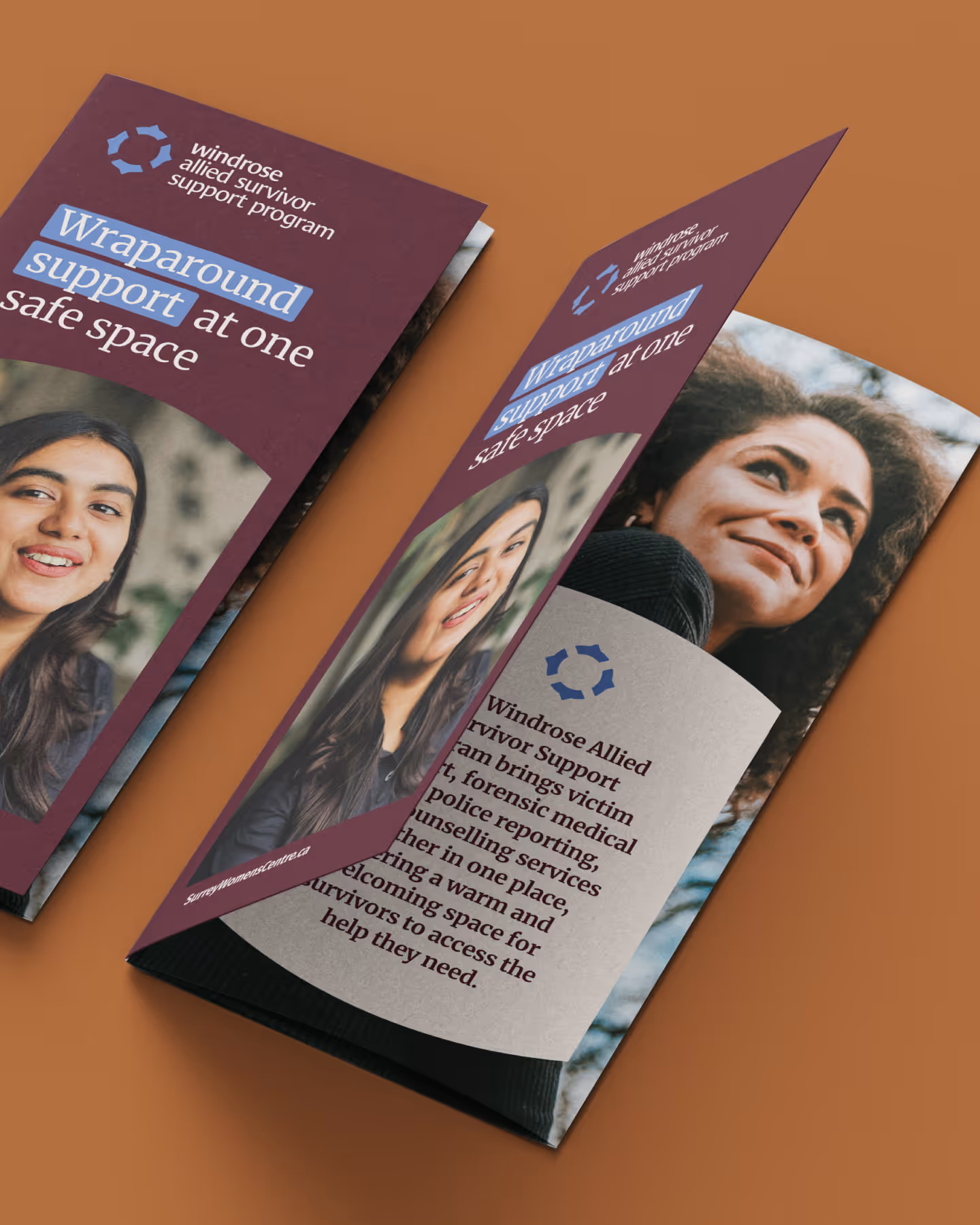
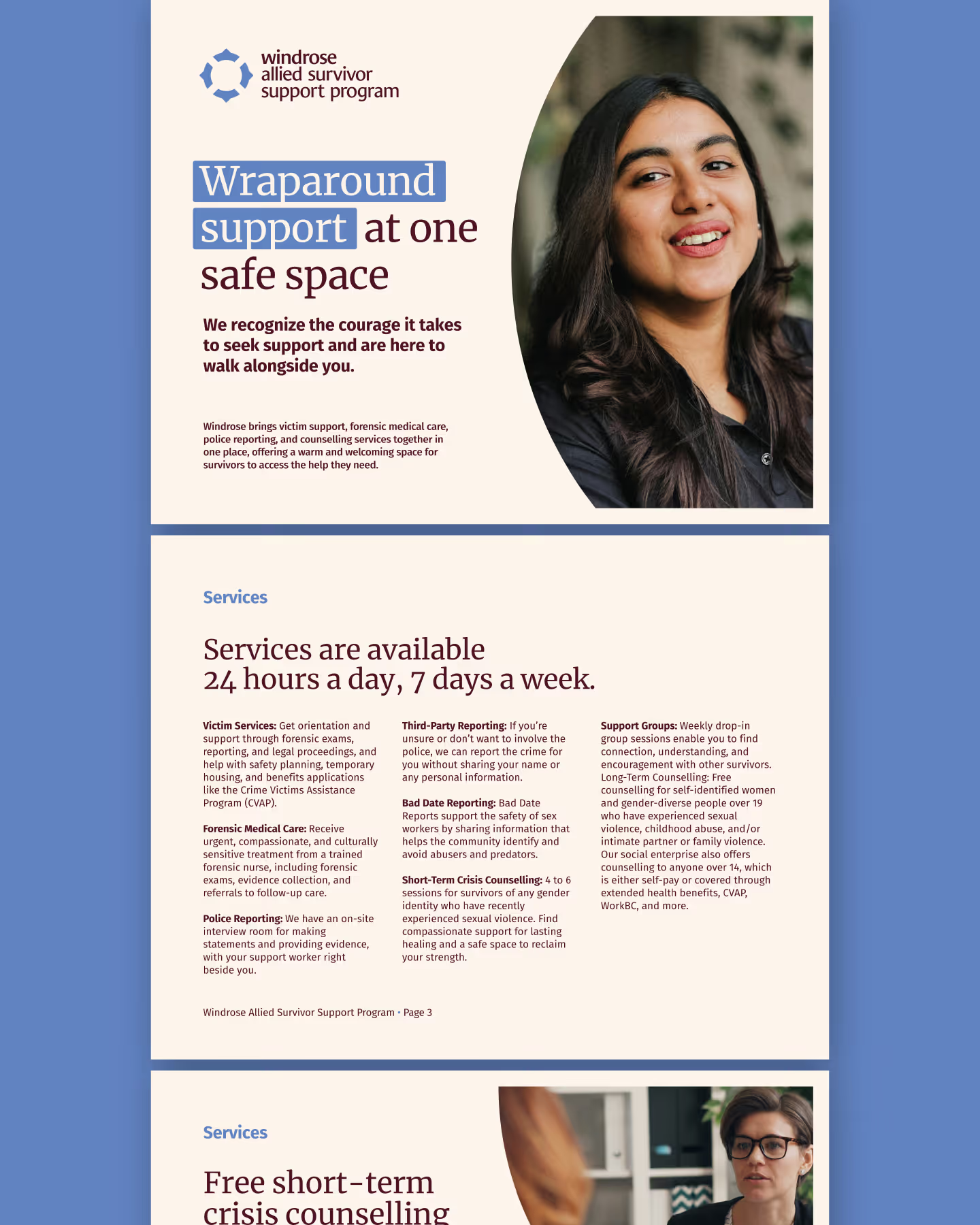
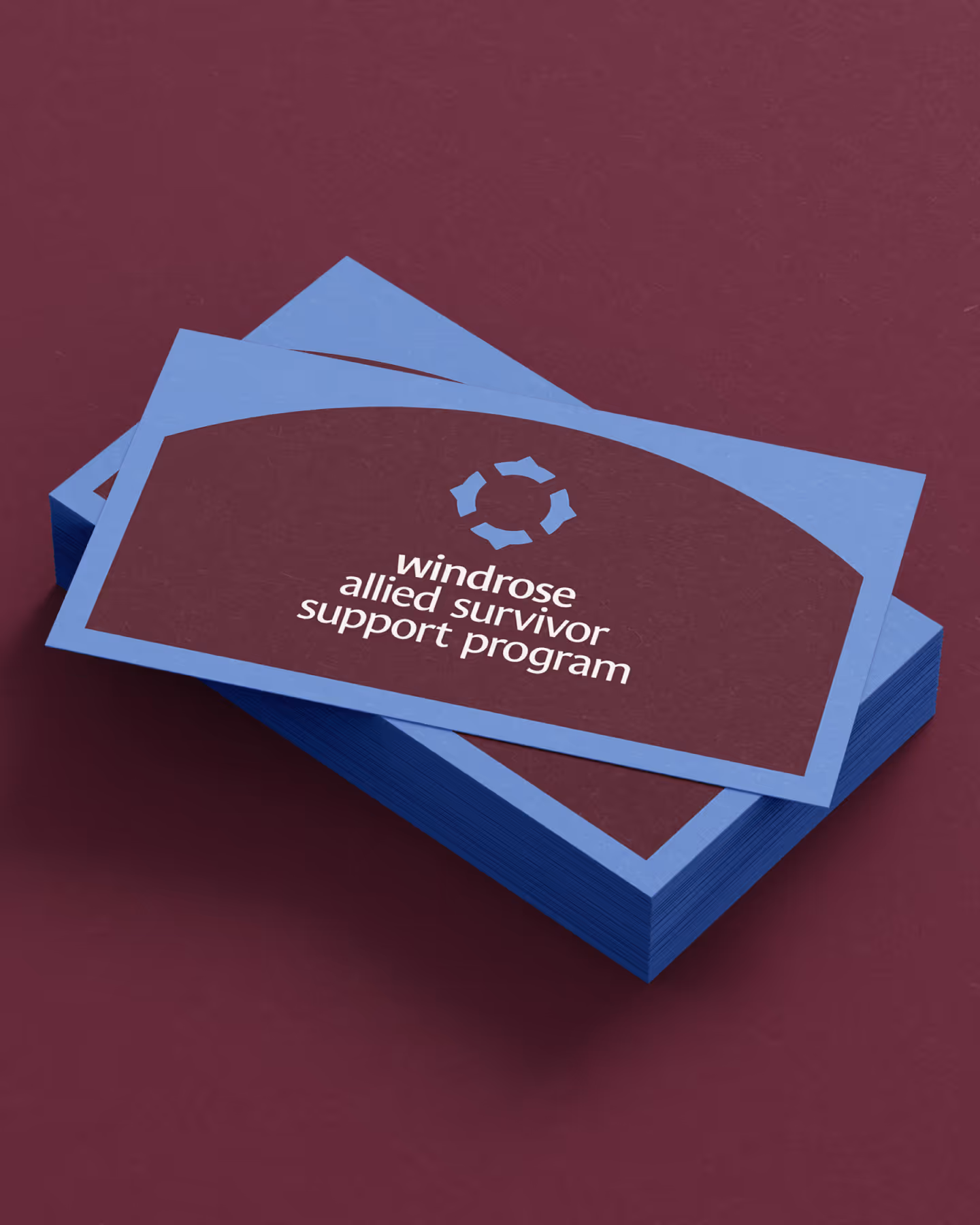
Launched in November 2025, the 'Windrose Allied Survivor Support Program' is the Surrey Women’s Centre’s specialized program supporting survivors of sexualized violence with forensic nursing, reporting, and counselling all in one site. Named by the Surrey Women’s Centre's team, the word "Windrose" draws inspiration from a compass rose, a symbol that shows wind direction and represents guidance, navigation, and resilience through rough seas. Our design approach focused on translating those ideas into a cohesive and meaningful visual identity for Windrose.
LeBlanc (& co.) Communications expanded the Surrey Women’s Centre’s branding in order to create the new sub-brand for Windrose. Building on the Surrey Women’s Centre’s main brand, the new Windrose logomark mirrors the main logo's circular form and sense of wholeness while introducing tapered spokes and directional notches to evoke movement and guidance.
The sub-brand's colour palette carries over the main brand's colours of Mulberry, Fuschia, Cream, and Bronze, introducing a new purple-blue hue - named Windrose - that evokes wind, sky, and endurance through turbulent conditions.
The resulting Windrose sub-brand feels both connected and distinct – capturing the spirit of navigation, guidance, and empowerment that defines this program.