Launching The West Broadway Community Land Trust
Client
Sectors
Housing
Services
Graphic Design
Creative Activation
Website Design
In Winnipeg, the vibrant neighbourhood of West Broadway is primarily a renter’s neighbourhood — with 93% of the community renting their housing, and many community members facing the impact of gentrification.
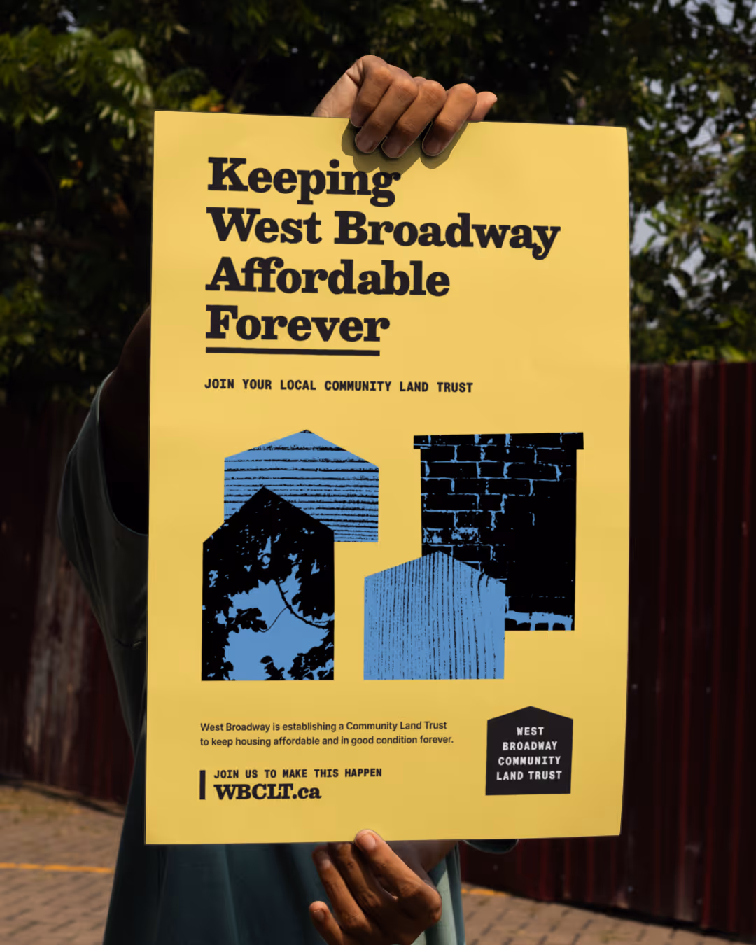
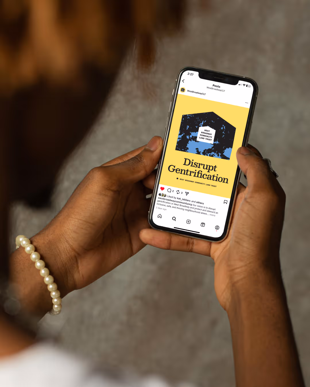
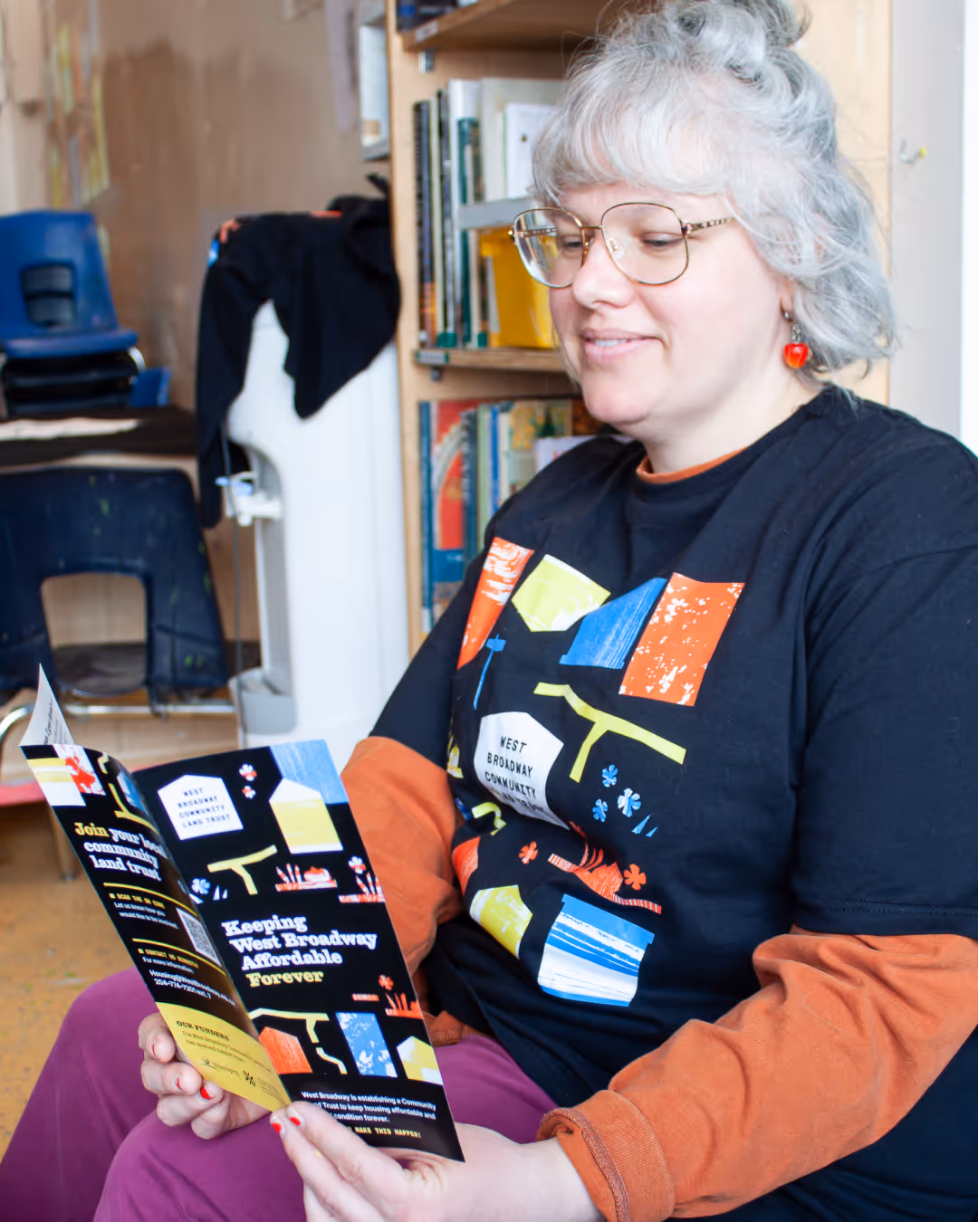
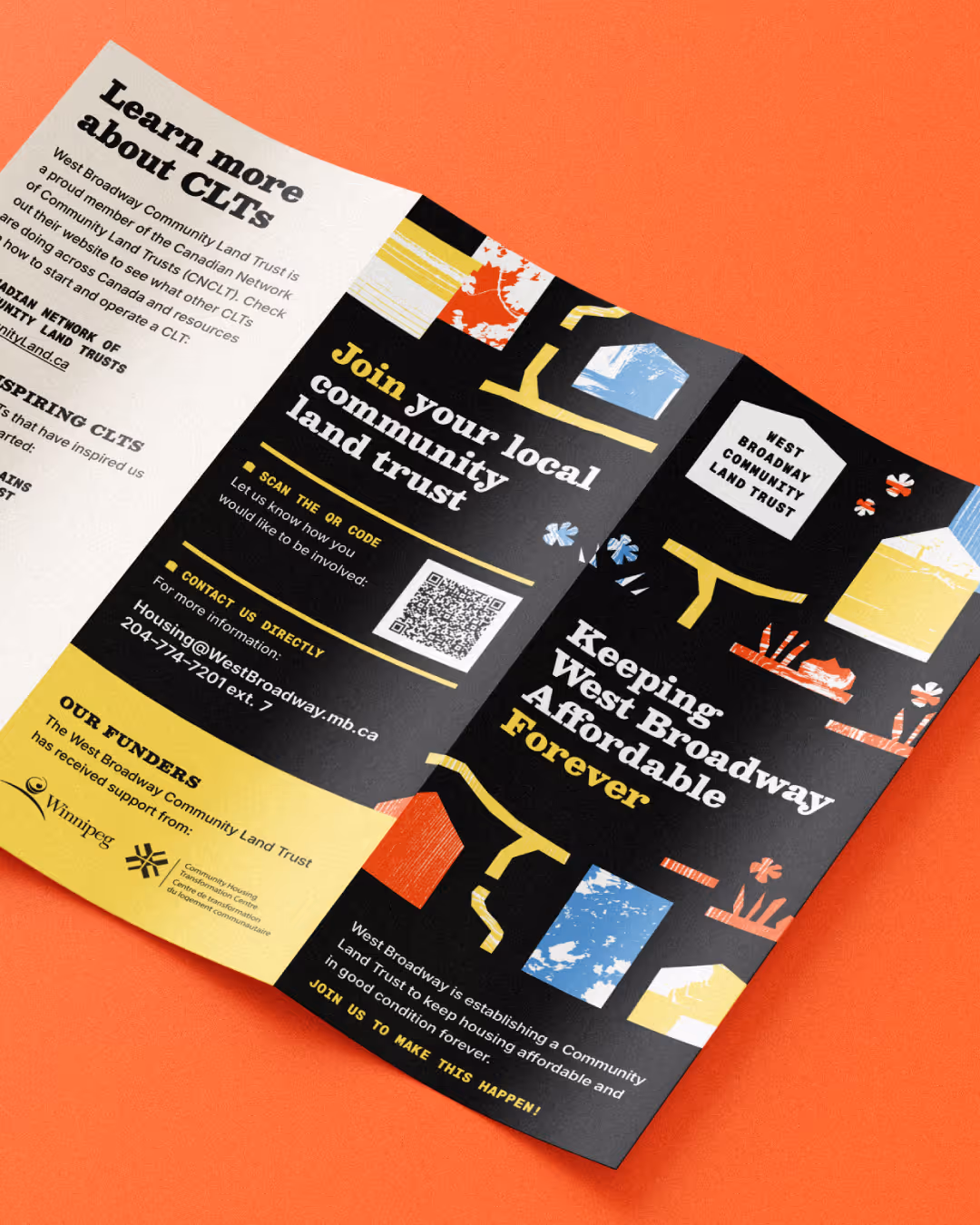
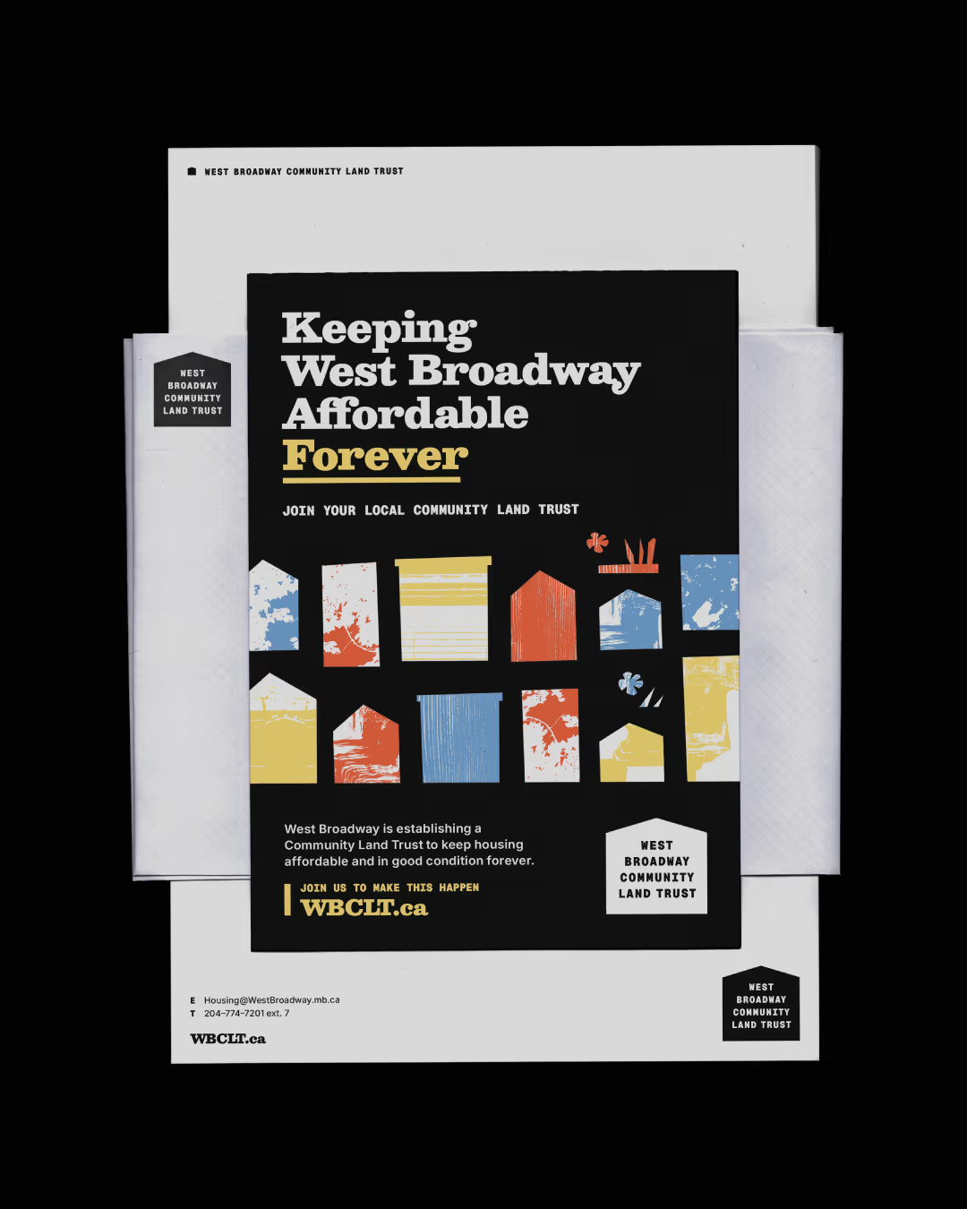
Newly launched in early 2026, the West Broadway Community Land Trust (WBCLT) works to protect affordable housing, disrupt gentrification, and steward an inclusive, safe, and thriving community in West Broadway. Through purchasing housing and real estate, the land trust’s mandate centres on helping community members live in tenure-secure, high-quality, and permanently affordable housing.
As the land trust prepared to launch, they needed a visual brand that could meet two strategic priorities at once: reflecting the lived experience of the West Broadway community and mobilizing this audience — while also establishing trust and credibility with institutional audiences like the government and funders. For the WBCLT’s team, it was important to serve these two audiences in a way that didn’t feel too corporate. To accomplish this, we wove in community at every chance we got: from photographing West Broadway, to leading an art session with the land trust, to bringing the neighbourhood's textures into the brand itself. As a result, the new brand brings authenticity, creativity, and an activist spirit, equipping the land trust to blossom in the community while also winning over the funders they need to fulfil their mission.
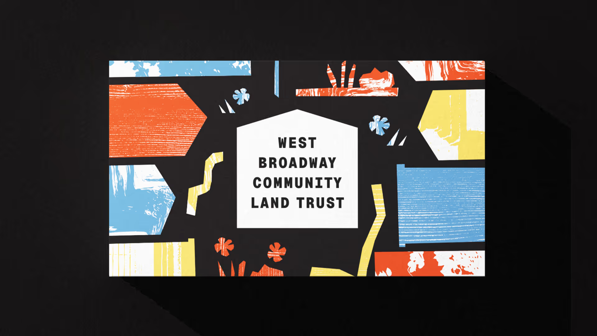
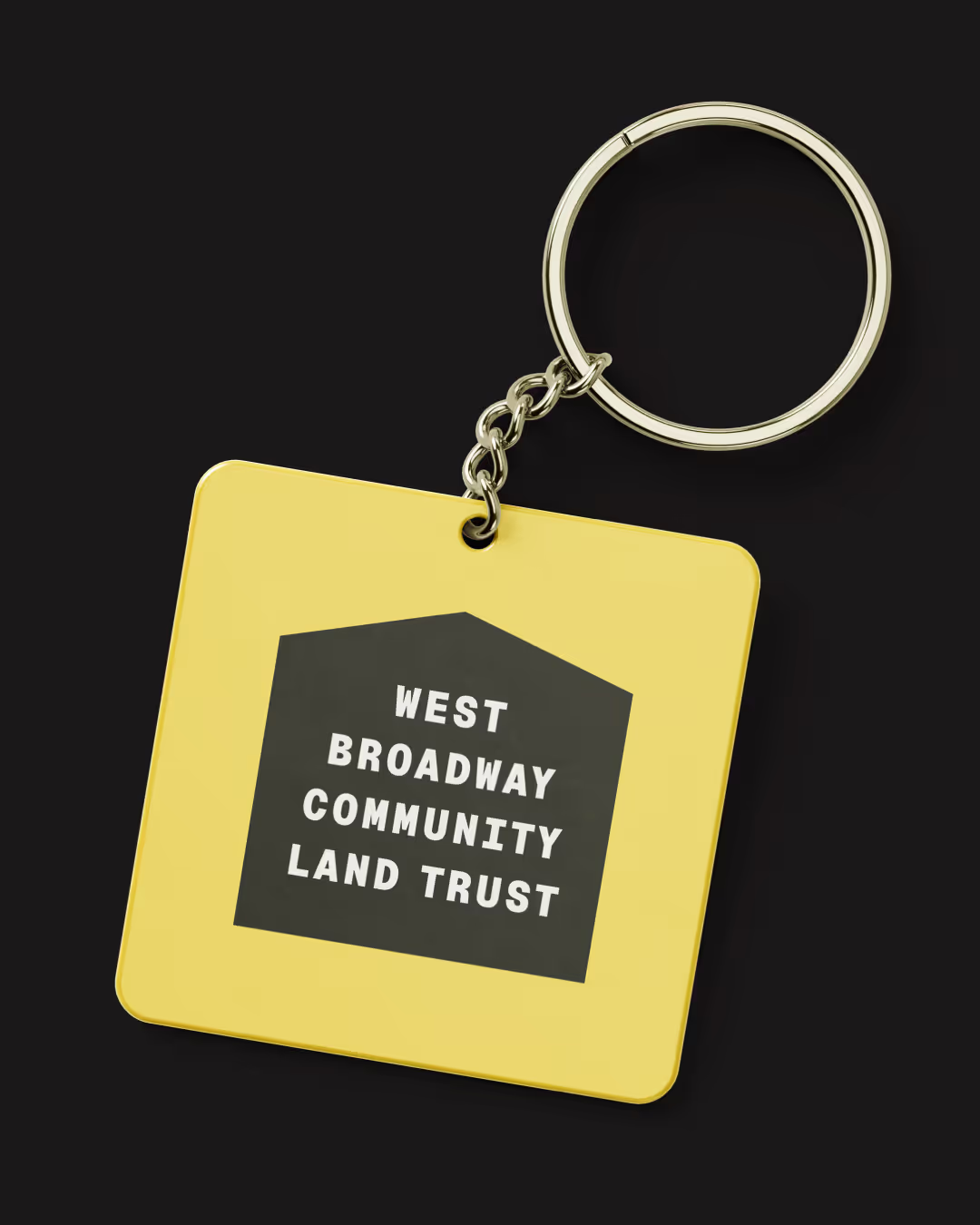
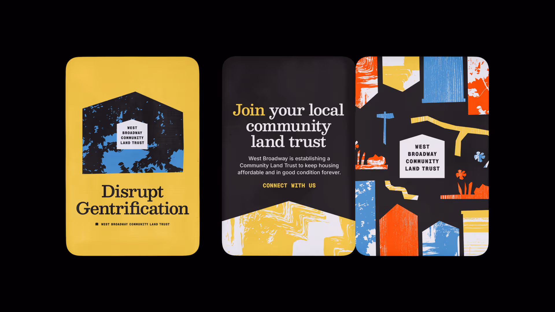
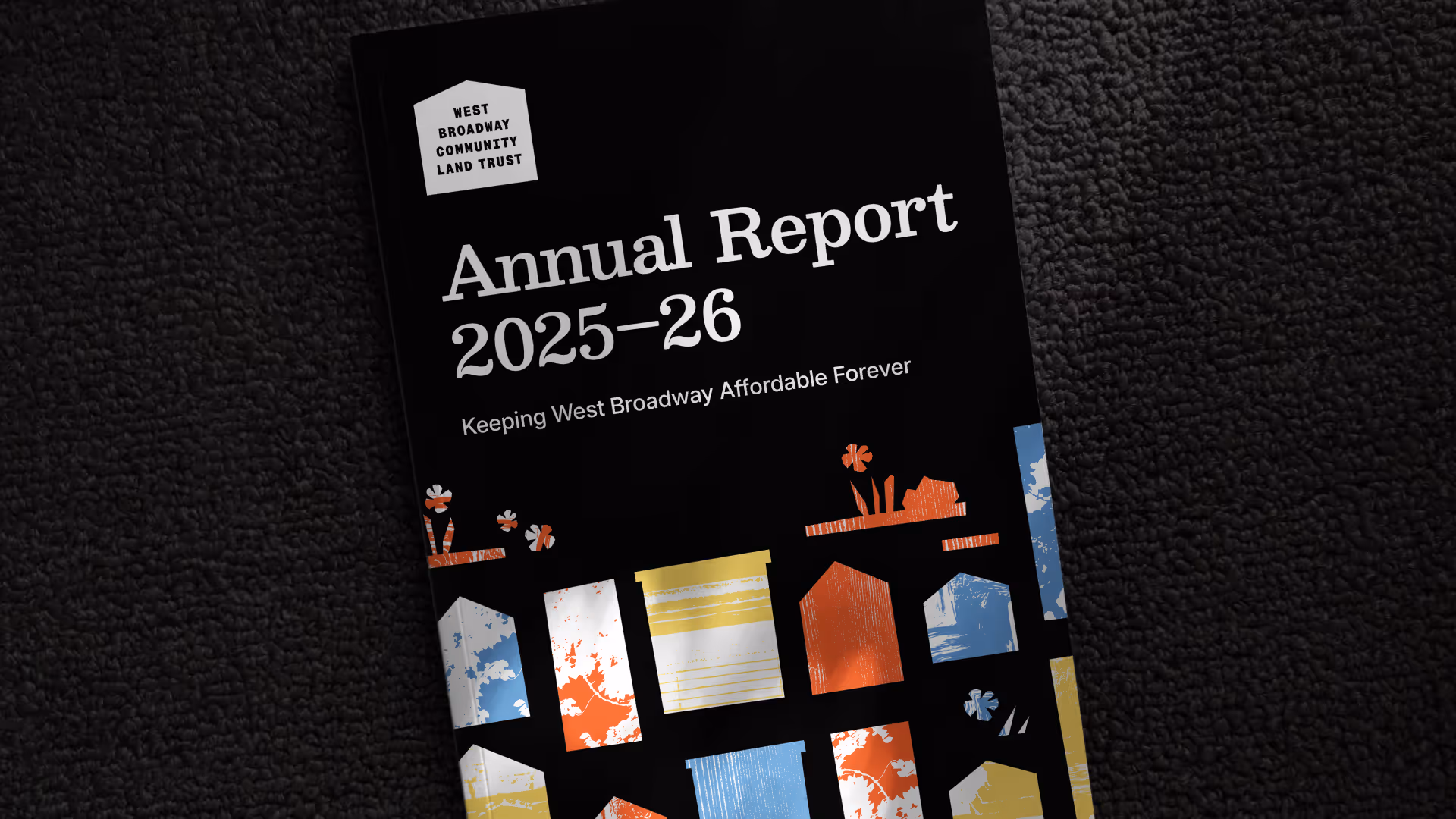
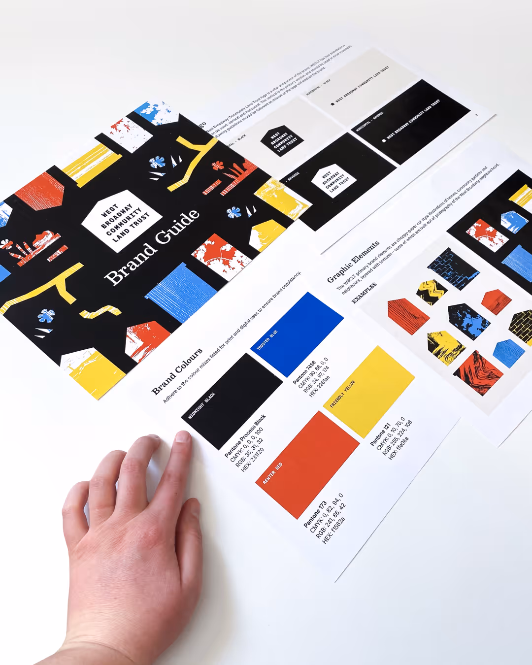
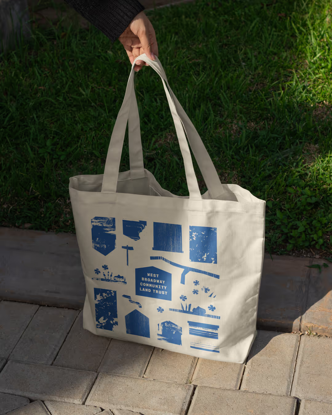
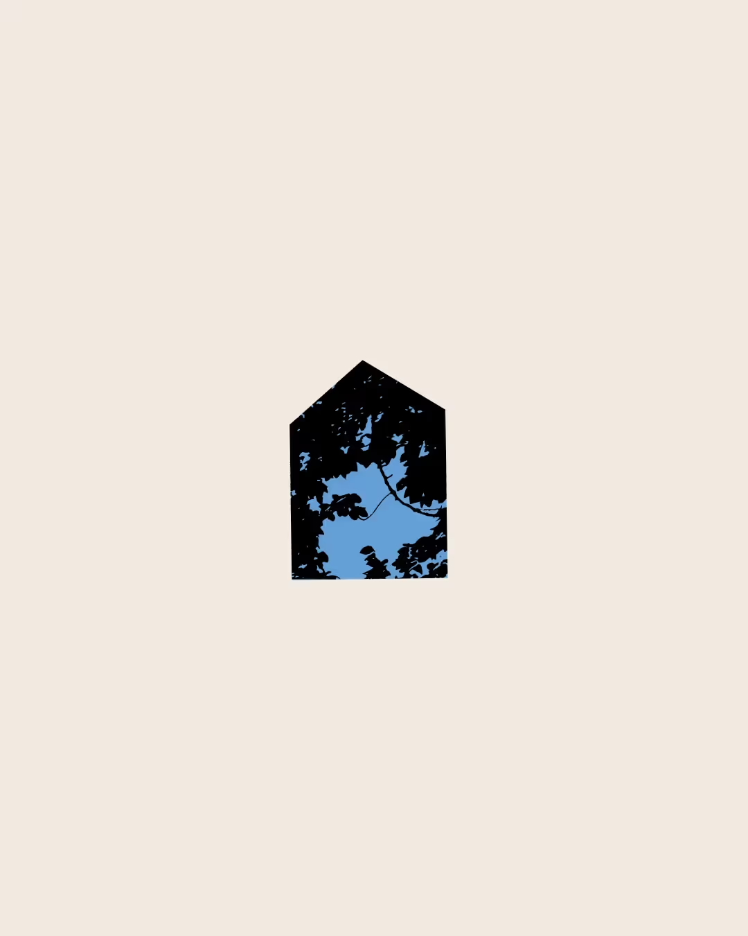
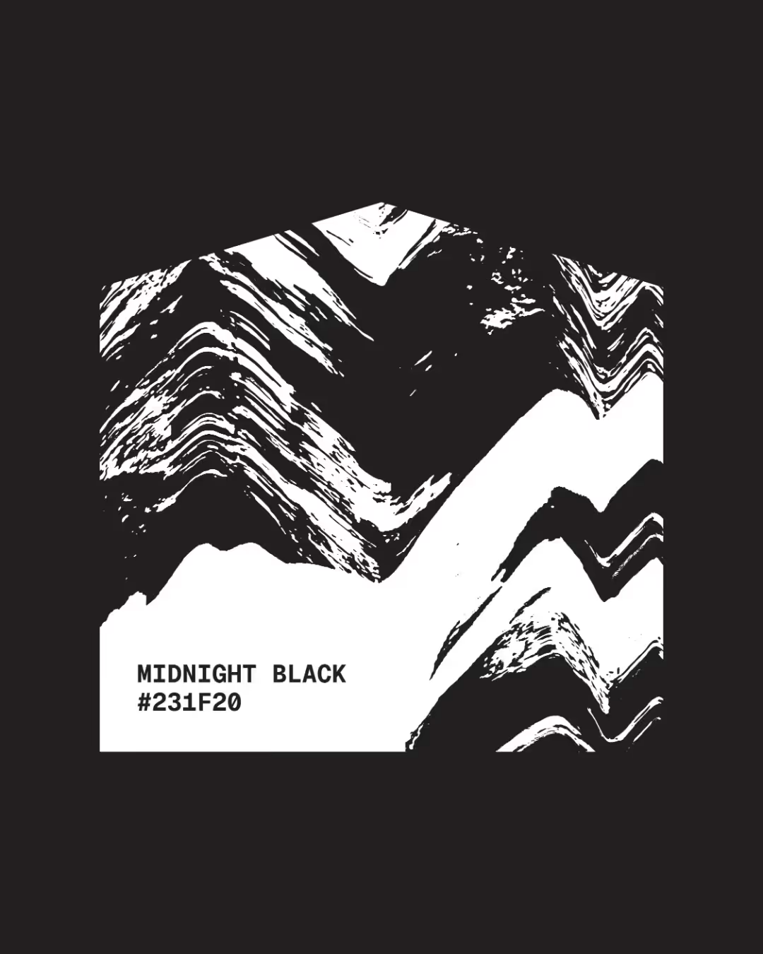
The new visual identity was developed to uniquely reflect West Broadway. “Cut-paper”-style illustrations of housing and shared community spaces bring authenticity to the brand. These shapes are layered with textures from photographs that our team took of the neighbourhood, of textures from bricks, wood siding, paint, tree branches, window coverings, and other architectural details. We augmented the original West Broadway photographs with other textures that help reel the audience into their story.
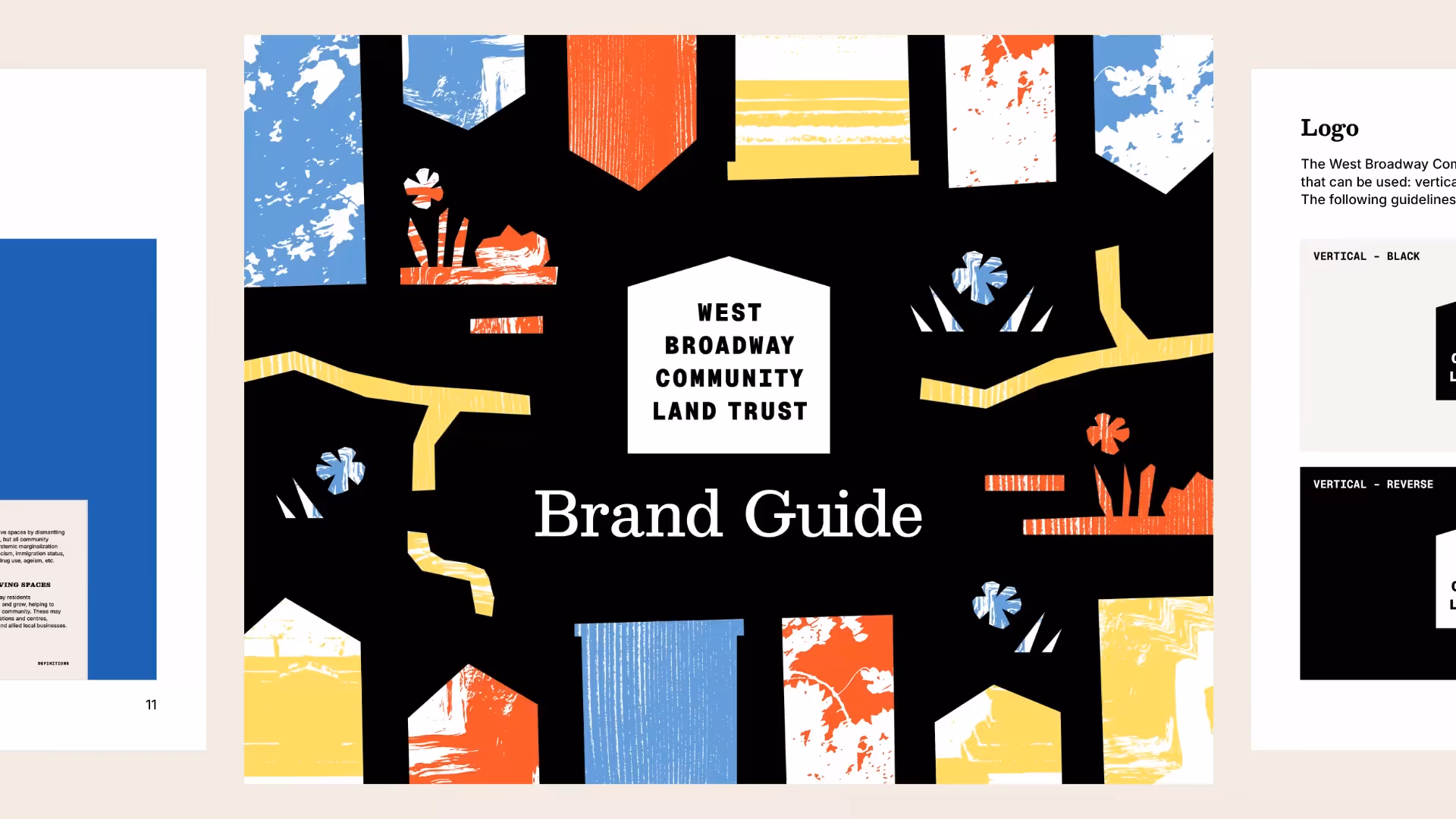
At the centre of the identity is a logo that frames the "West Broadway Community Land Trust" name within a form inspired by a building, directly reflecting the organization’s mission. The logo’s simplicity was intentional and strategic. By keeping the logo mark clean and restrained, the broader brand system allows for richer textures, illustrations, and layered visuals without compromising clarity. This ensures the identity remains expressive and activist-centred.
Together, these visual elements reinforce the West Broadway Community Land Trust's role as a steward of the community. The brand provides the WBCLT with a visual identity that is deeply connected to the neighbourhood it serves. It reflects the organization’s values, supports clear and consistent communication, and establishes a flexible foundation for storytelling, advocacy, and long-term growth, strengthening WBCLT’s ability to build and protect permanently affordable housing for generations to come.

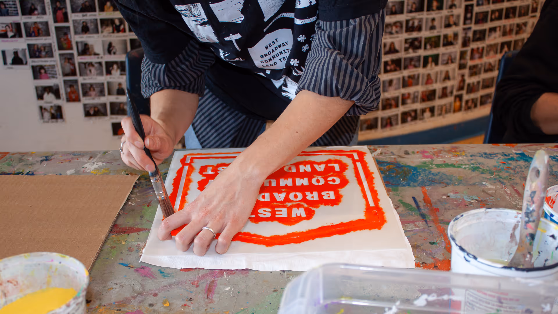
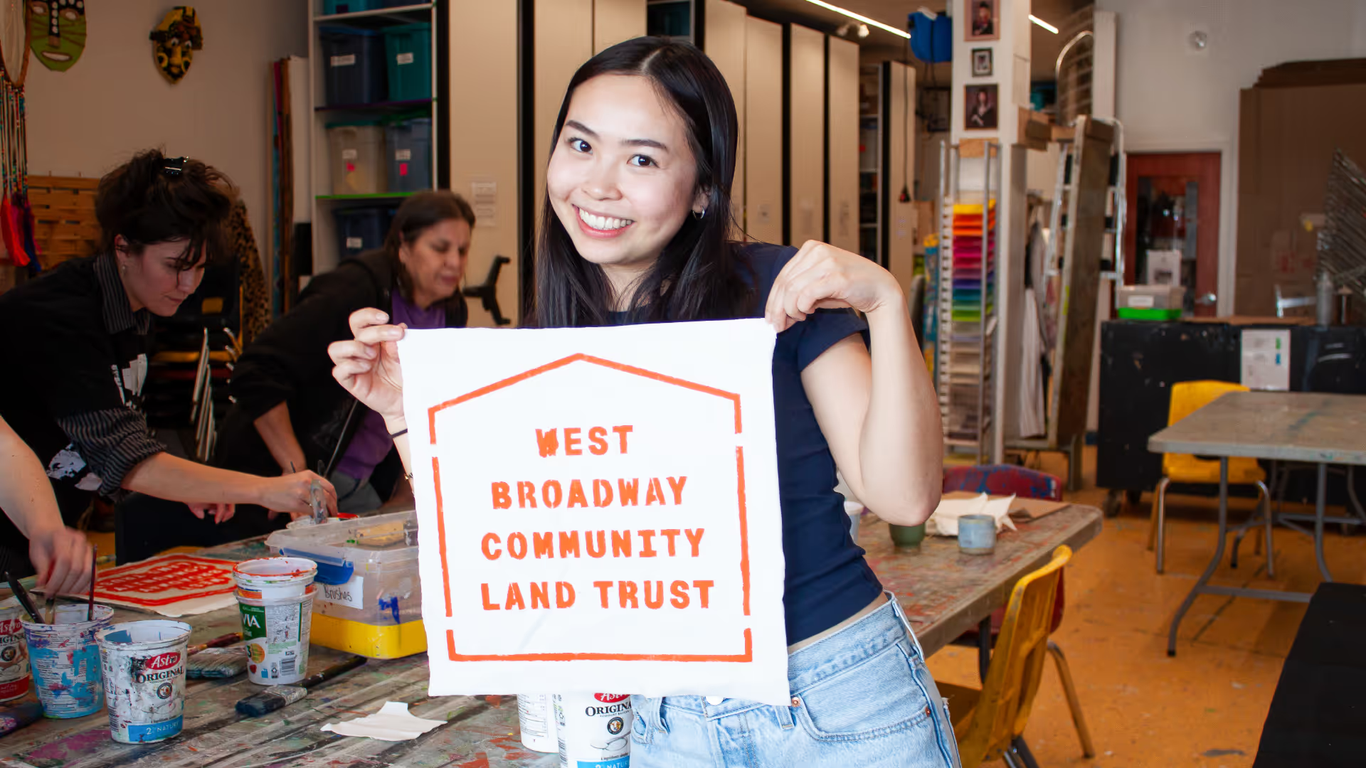
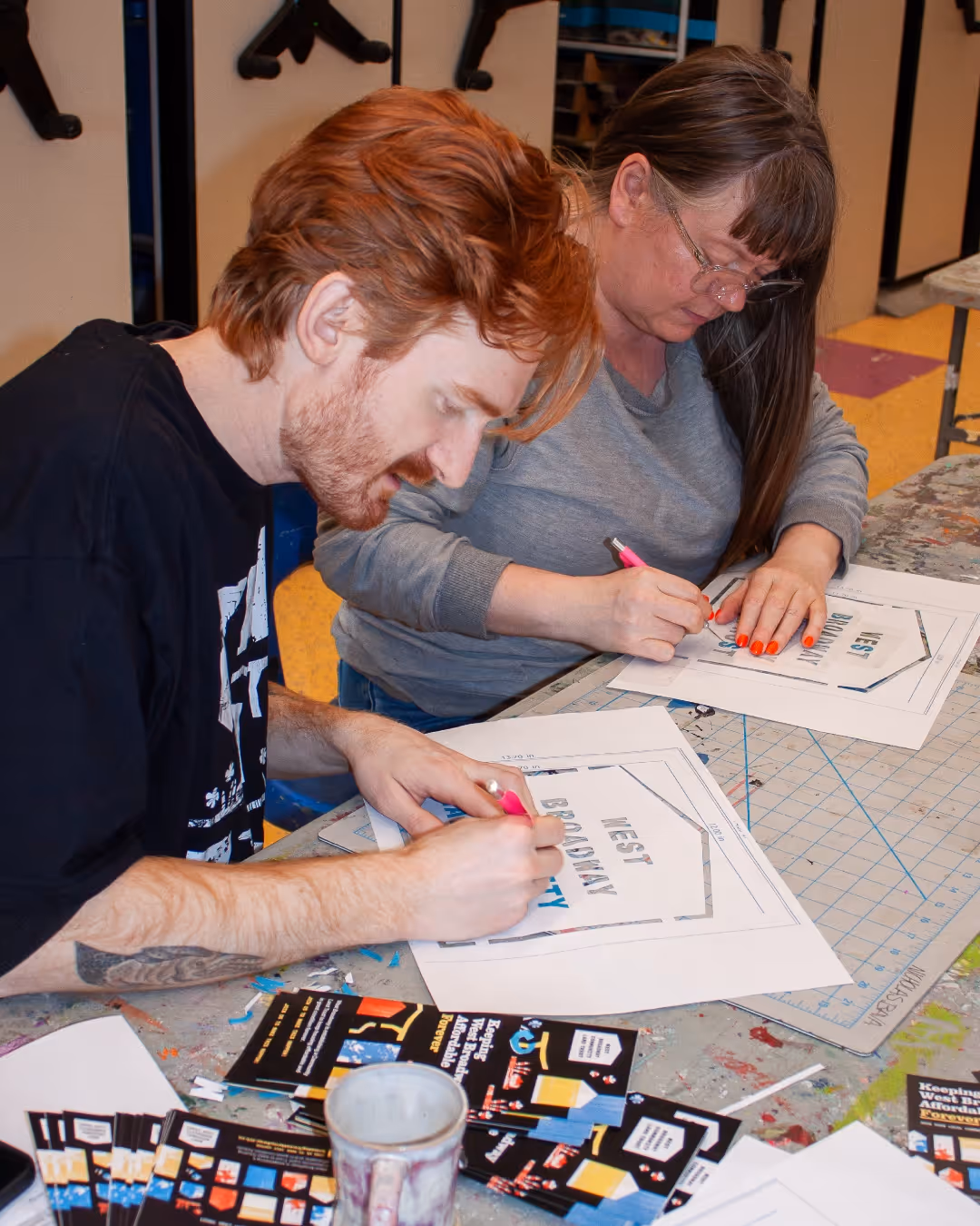
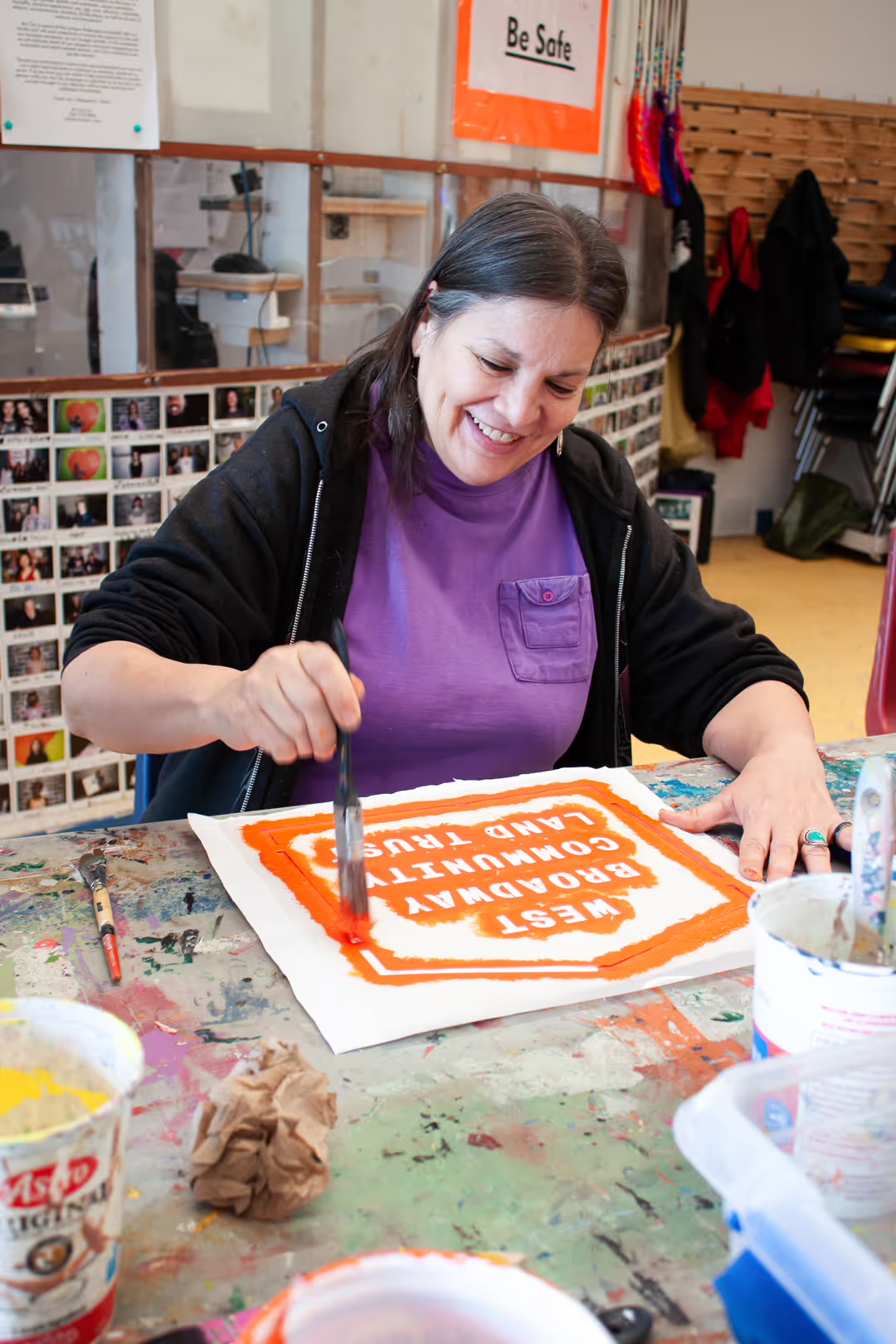
Art Build Session
To meet the goal of creating a brand grounded in community, the West Broadway Community Land Trust held an art session with their members. Working with Art City, a nonprofit studio in West Broadway, the land trust created a handmade banner and a set of smaller window signs. We custom-ordered a durable plastic stencil with their logo on it and experimented with printing additional paper stencils.
From the beginning of the branding process, our teams wanted to establish a participatory way to engage WBCLT members and bring the brand’s handmade feeling to life in an authentic and grassroots way.
Now the land trust is equipped to continue making art without us — using their branded stencil to create signs, merch, and any other materials required.
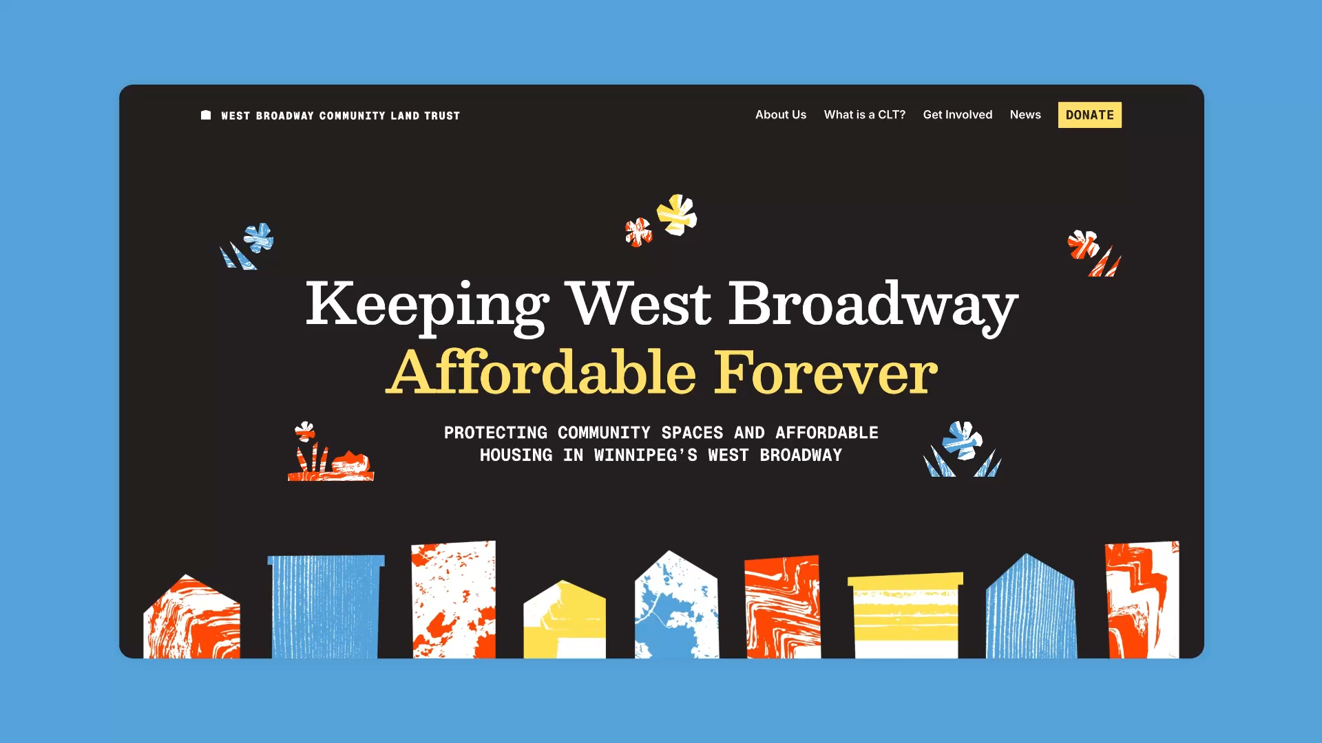
Website
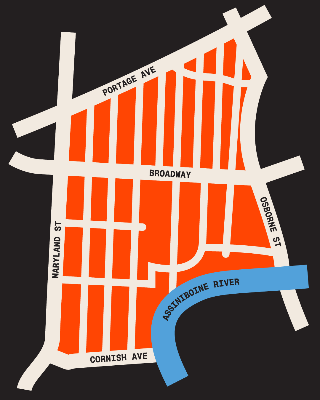
We designed a vibrant one-page website for the West Broadway Community Land Trust, weaving in their distinctive collage brand elements to create a visually dynamic digital presence. Custom photography and neighbourhood map bring the community to life throughout the site, helping visitors connect with the work and geography of the land trust. The result is a site that feels approachable and true to WBCLT's identity.
We also developed an additional template page that gives the WBCLT a flexible foundation to expand their web presence over time.
.png)

.png)

