Manitoba Federation of Labour
Client
Sectors
Labour
Advocacy
Services
Brand Development
Convention Branding
Graphic Design
Photography
A New Look for a Growing Labour Movement
The Manitoba Federation of Labour (MFL) brings together unions from across the province to advocate for workers' rights and build a stronger labour movement. As the collective voice of its member unions, the MFL unites people in solidarity, organizes around shared priorities, and brings workers into conversations with government.
In recent years, Manitoba's labour movement has won important victories, including the return of card-check certification and new anti-scab legislation (the strongest in Canada!). With momentum building and a brand that hadn't been updated since 2013, the MFL felt it was time for a new look.
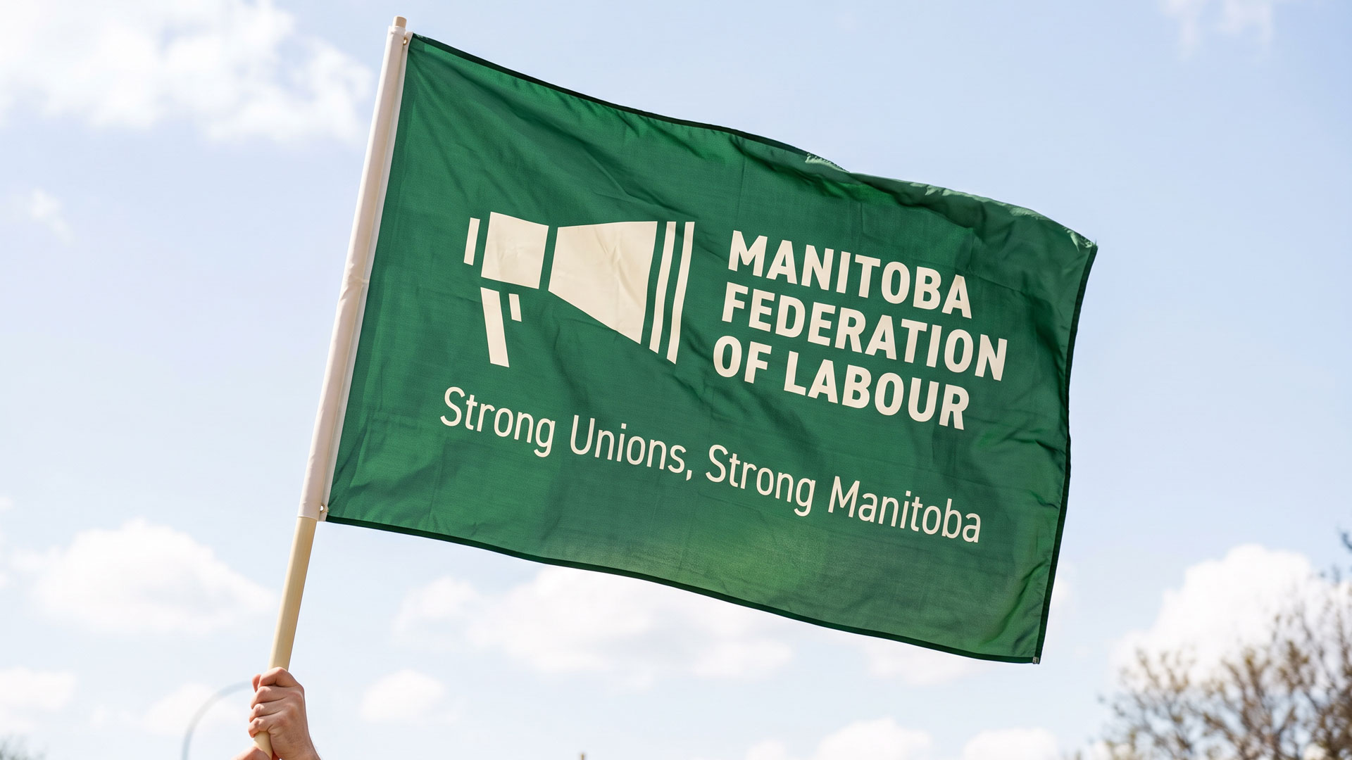
They came to us seeking a brand that would reflect the strength of Manitoba's labour movement and make members feel proud to be part of it. It needed to carry authority in meetings with government, and feel just as natural printed on a picket sign.
We worked with the MFL to develop a new visual identity and convention brand that could bring its members together and carry the movement forward.
Brand Development
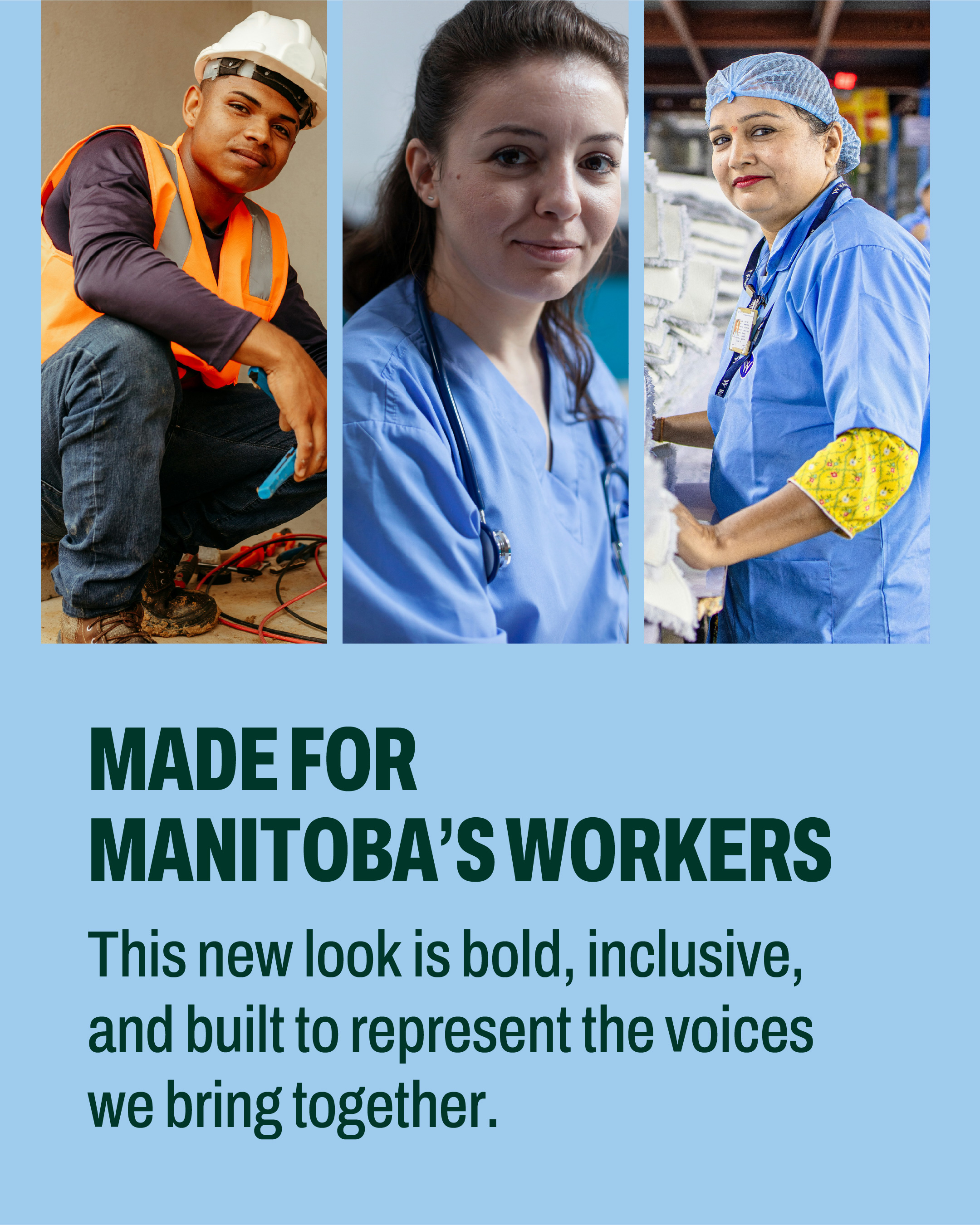
As a provincial federation of labour, the MFL represents workers from many different unions, industries, and communities. The challenge was to create an identity that all members could see themselves in, while giving the MFL a distinct presence alongside its affiliated unions.
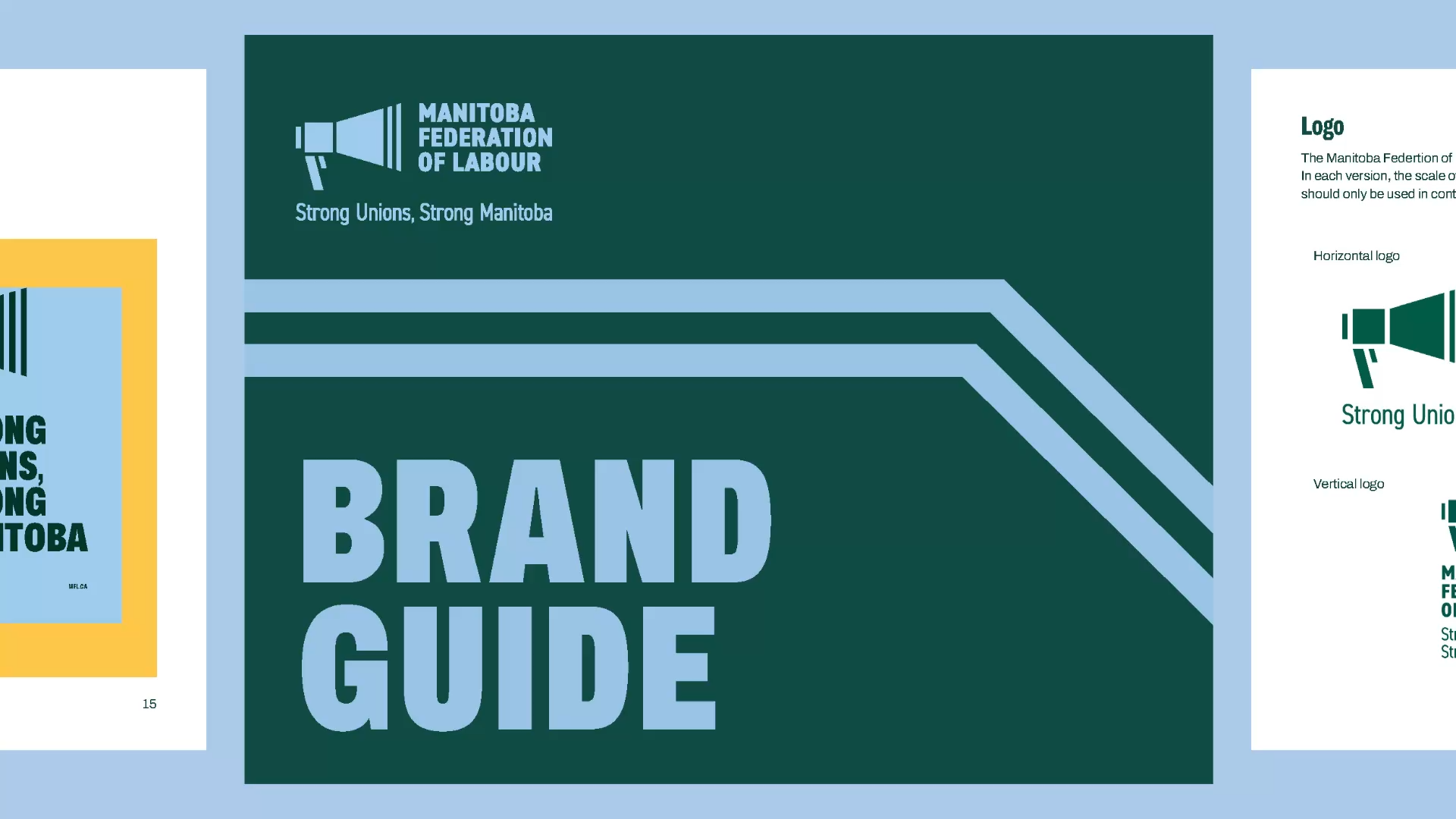
We wanted the brand to feel distinctly Manitoban. Geometric shapes echo the outline of the province, giving the identity a connection to place while creating flexible graphic elements that can be used throughout the MFL's materials.
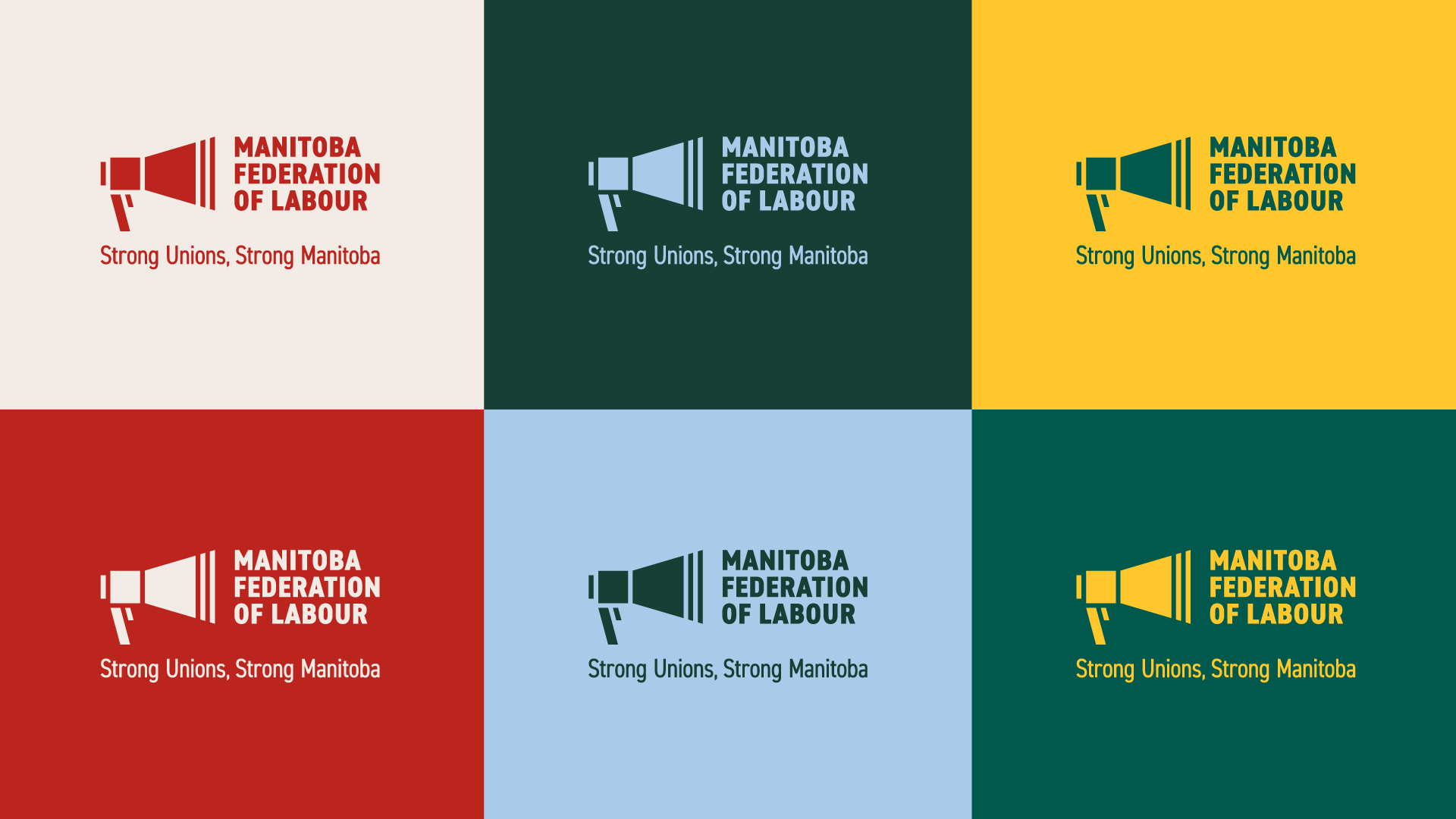
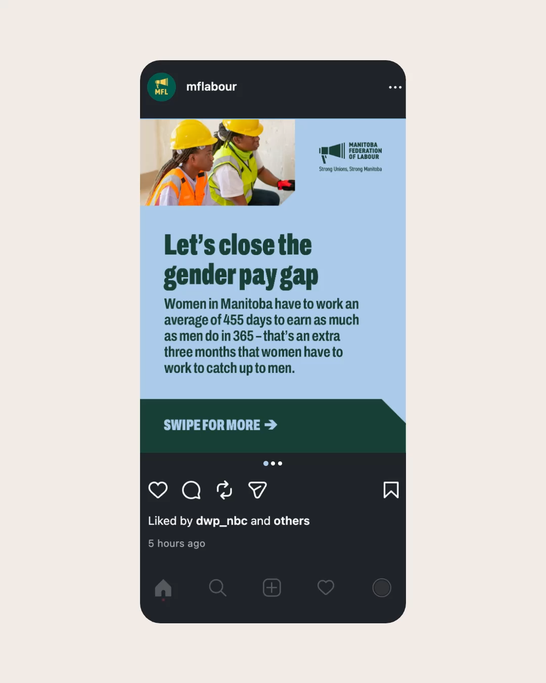
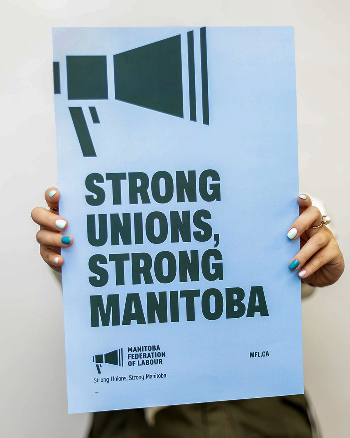
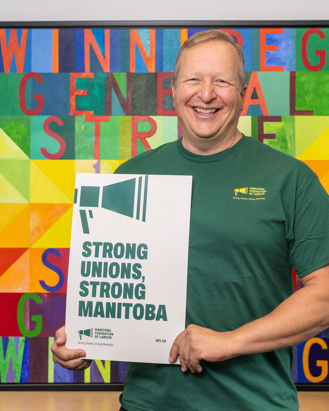
The approved concept embraced bold typography, a vibrant colour palette, and the visual language of labour organizing, and drew inspiration from both union posters and homemade protest signs. The colours were chosen to help the MFL stand out and bring a fresh sense of energy to its communications. Strong contrasts and large, confident typography make the identity easy to recognize, whether it's appearing on a phone screen or being carried through a crowd at a rally.
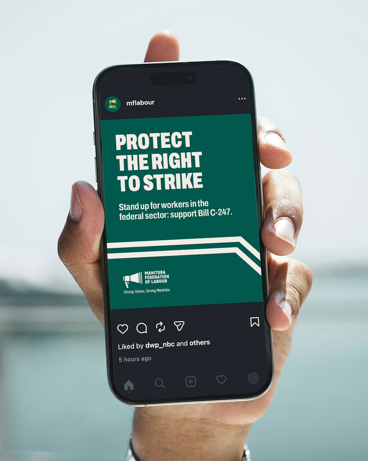
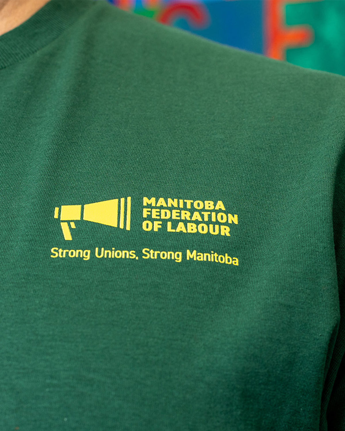
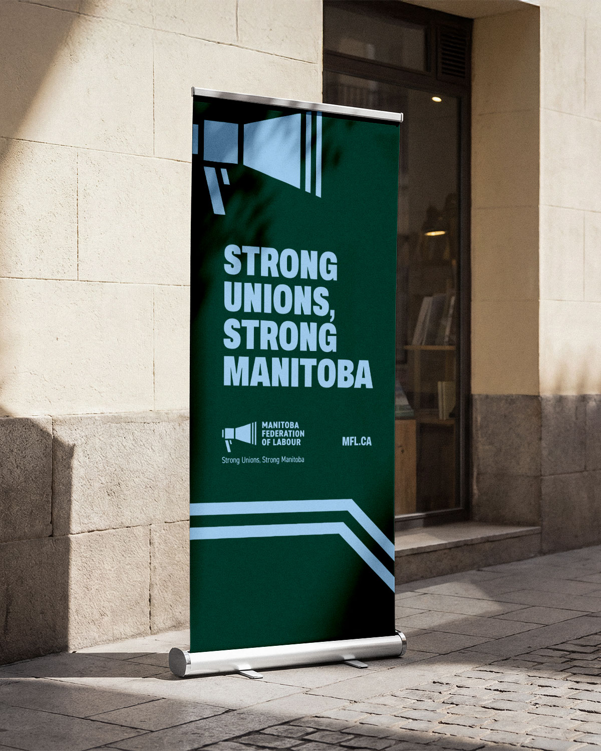
The Manitoba Federation of Labour used the rebrand as an opportunity to cement its new slogan: Strong Unions, Strong Manitoba. We designed the identity so the slogan could appear prominently across campaign materials, digital communications, and other applications, reinforcing the message wherever members encounter the brand.
Bringing the Brand to Life
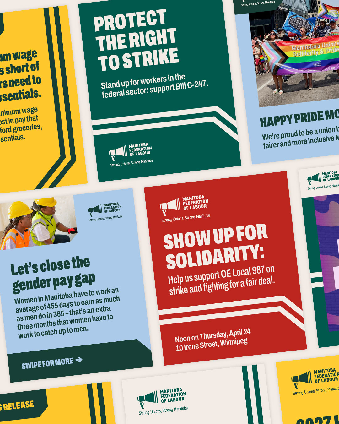
The MFL's work happens in many different places: on the picket line, in the legislature, at rallies, and wherever workers come together to organize. We developed a flexible brand system that could move between these settings while staying recognizable.
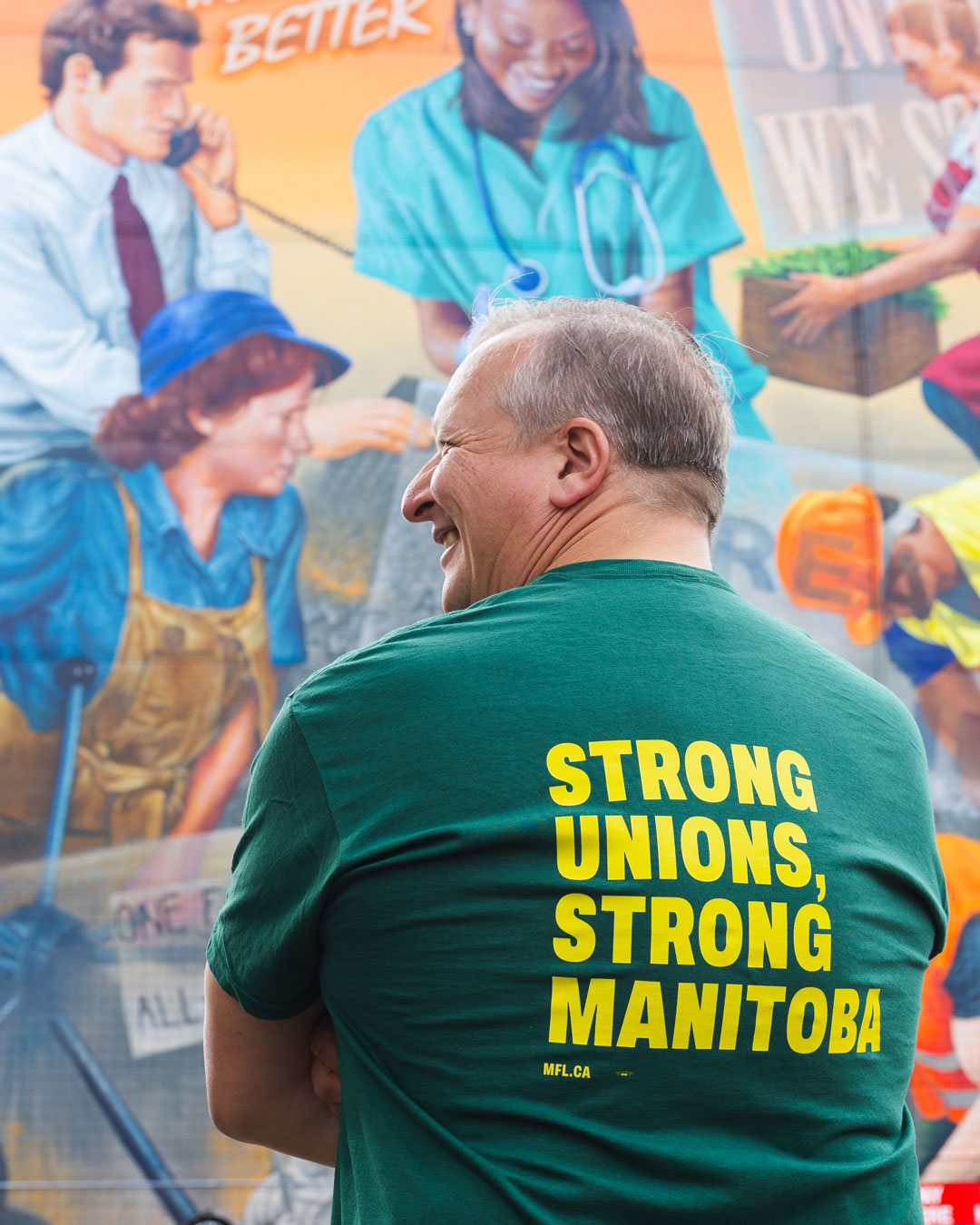
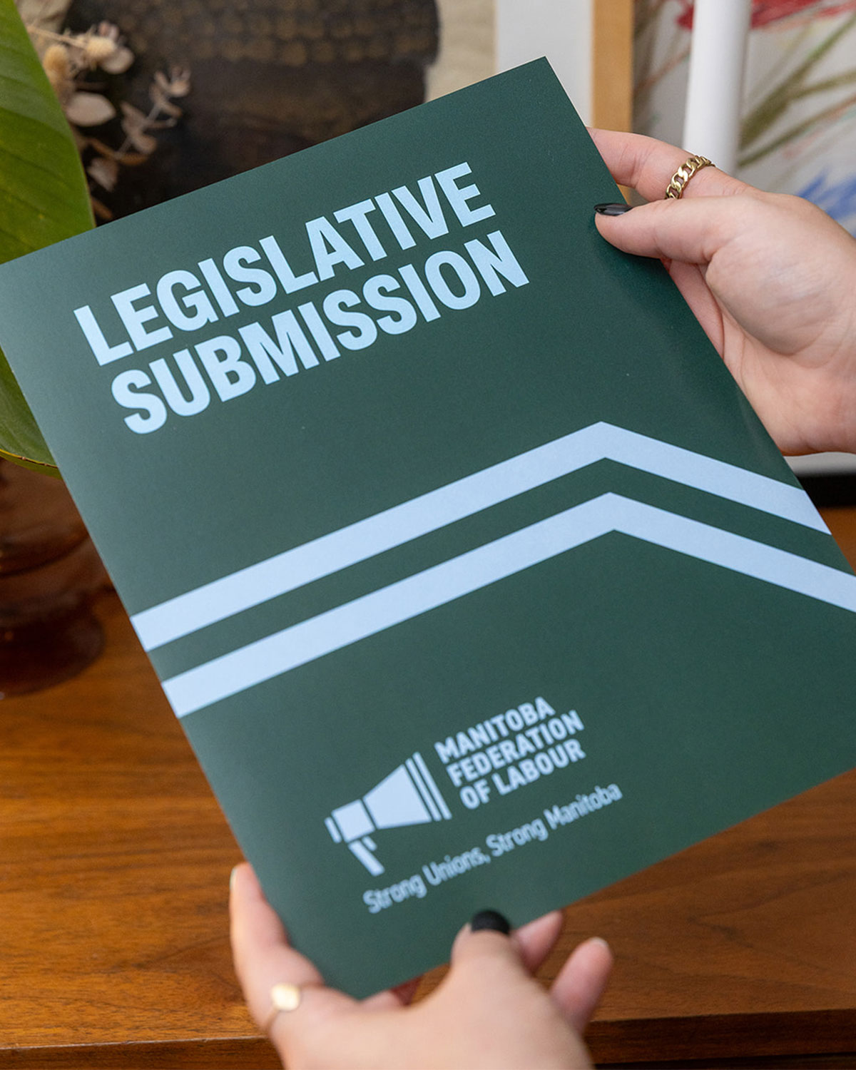
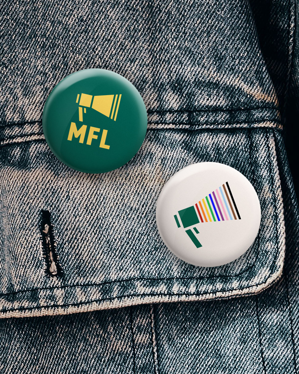
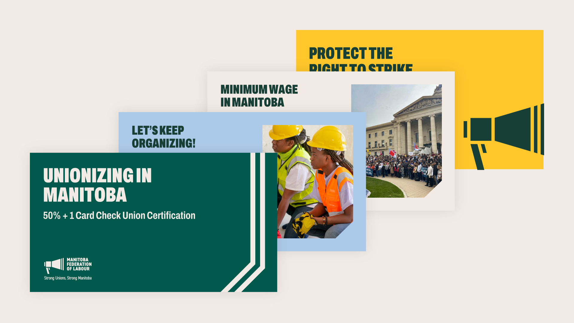
Alongside the new logo and Brand Guide, we created social media and digital templates, presentation materials, and supporting collateral. We also considered how the brand would appear on the materials that are part of everyday labour organizing, like stickers or clothing.
The new identity gives the MFL a stronger visual presence as it builds on recent victories and looks toward the work ahead. It's a brand designed to be seen wherever workers come together, and to belong to the people the MFL represents.



Convention Branding
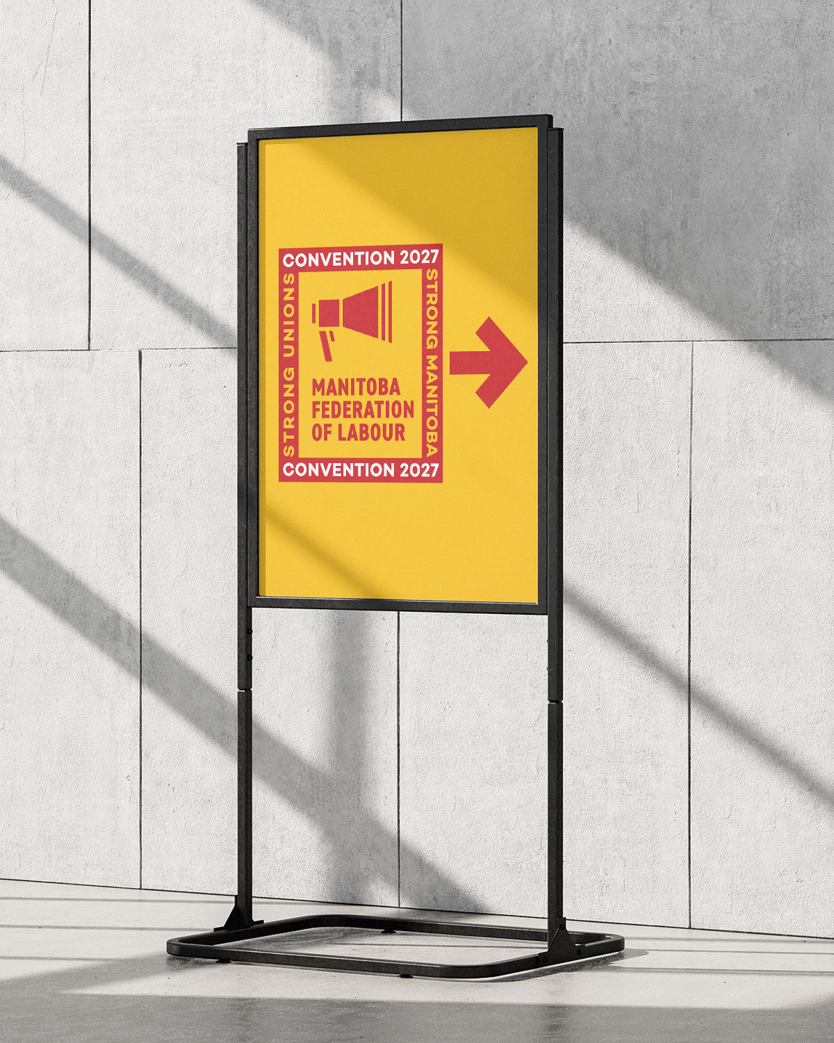
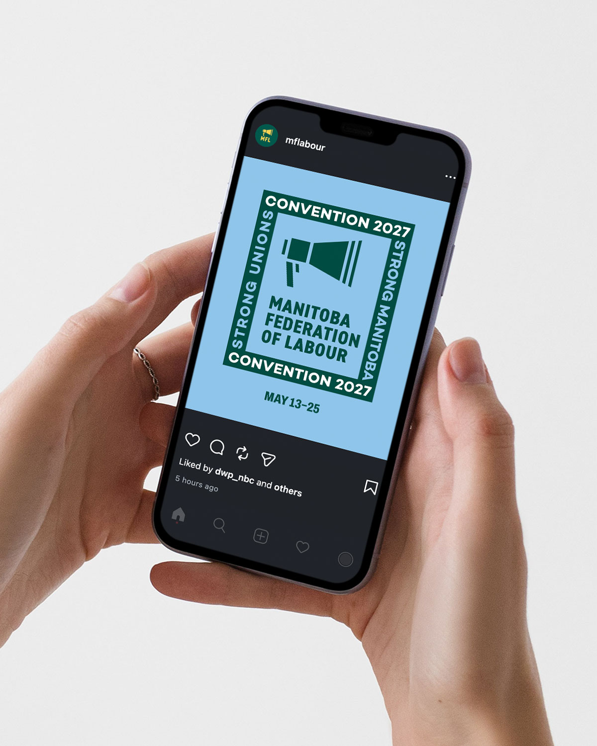
The Manitoba Federation of Labour’s upcoming convention offered an opportunity to bring the new identity directly to the members it represents.
We developed a convention brand that builds on the MFL's refreshed visual language while giving the gathering its own presence. Using the same typography, colours, and graphic elements, the convention identity connects the event to the larger organization.
The design was developed with the many ways members experience a convention in mind, from promotional communications leading up to the gathering to presentations and signage used onsite. The result is a convention identity that feels part of the MFL's new chapter and helps create a shared sense of occasion for delegates coming together from across the province.